Google Sheets Tutorial
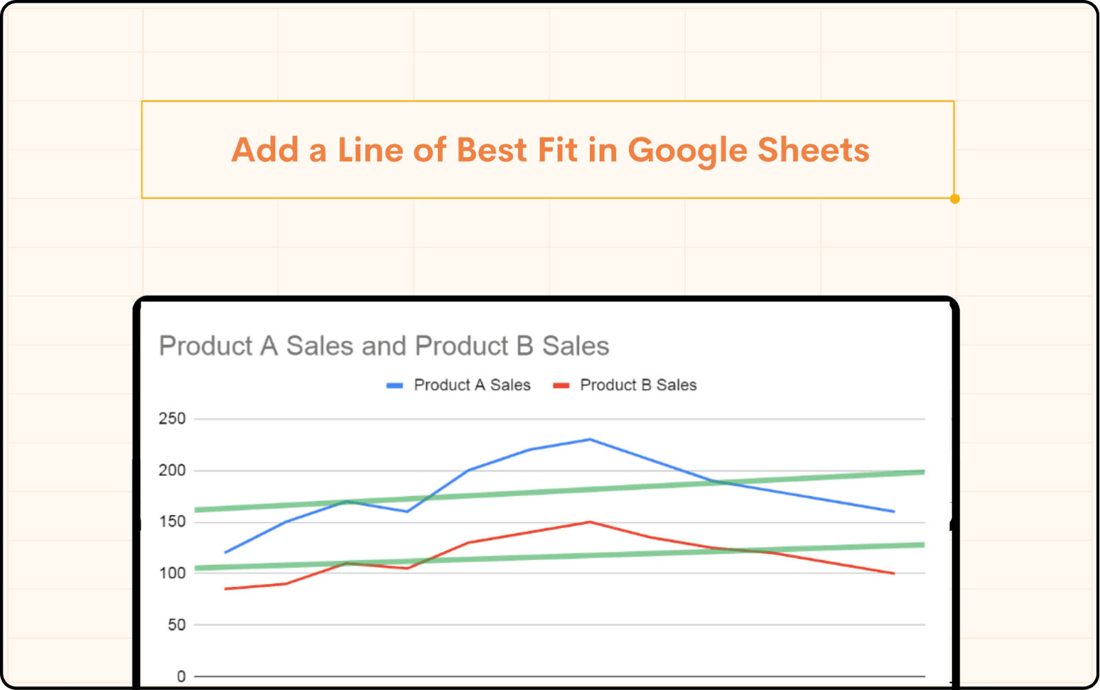
Add a Line of Best Fit in Google Sheets
Learn how to put a line of best fit in Google Sheets with easy to follow steps. Ideal for business people who want to analyse patterns and base their decisions.
Table of Contents
Making wise judgements in Google Sheets depends on the ability to see trends, hence data visualisation is absolutely important. Learning how to add a line of best fit to your scatter plots or charts will help you to accomplish this most efficiently. Whether your analysis is of sales data, performance tracking, or future trend prediction, knowing how to properly apply and evaluate a line of best fit will be quite helpful. This blog will walk you through adding a line of best fit in Google Sheets and offer tips on maintaining accuracy.
What is The Line of Best Fit
On a scatter chart, the line of best fit, or trend line, is a straight line that represents the data. It minimizes the distance of each data point from itself, making it an excellent tool for estimating future values based on past performance. For more advanced customization of your charts, you can explore creating custom reports in Google Sheets to better visualize and analyze your data.
How to Add a Line of Best Fit in Google Sheets
There are several ways to add a line of best fit in Google Sheets. Below are the most common methods:
Built-in Chart Tools
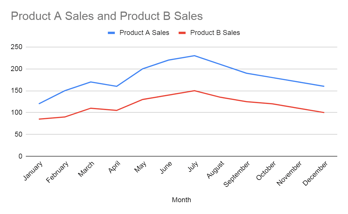
Create a Chart: First, select your data range. Then, navigate to "Insert" > "Chart". This will create a default chart based on your data. If you're working with large datasets, consider connecting an external data source to keep your data up-to-date.
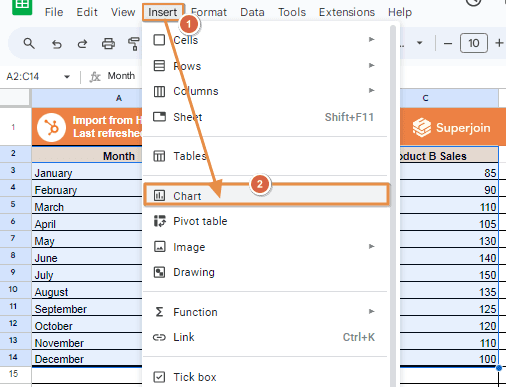
This will create a default chart based on your data.
Customise the Chart: Click on the chart, and select "Customise" from the chart editor on the right.
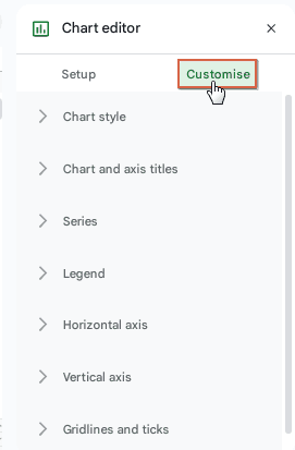
Add a Trendline: Under the "Series" section, you will find the option to add a “Trend line”. Select "Linear" to create a straight line of best fit.
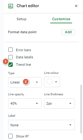
Adjust Settings: Customise the trendline by adjusting its colour, opacity, and thickness. You can also display the equation on the chart, which is useful for precise predictions.
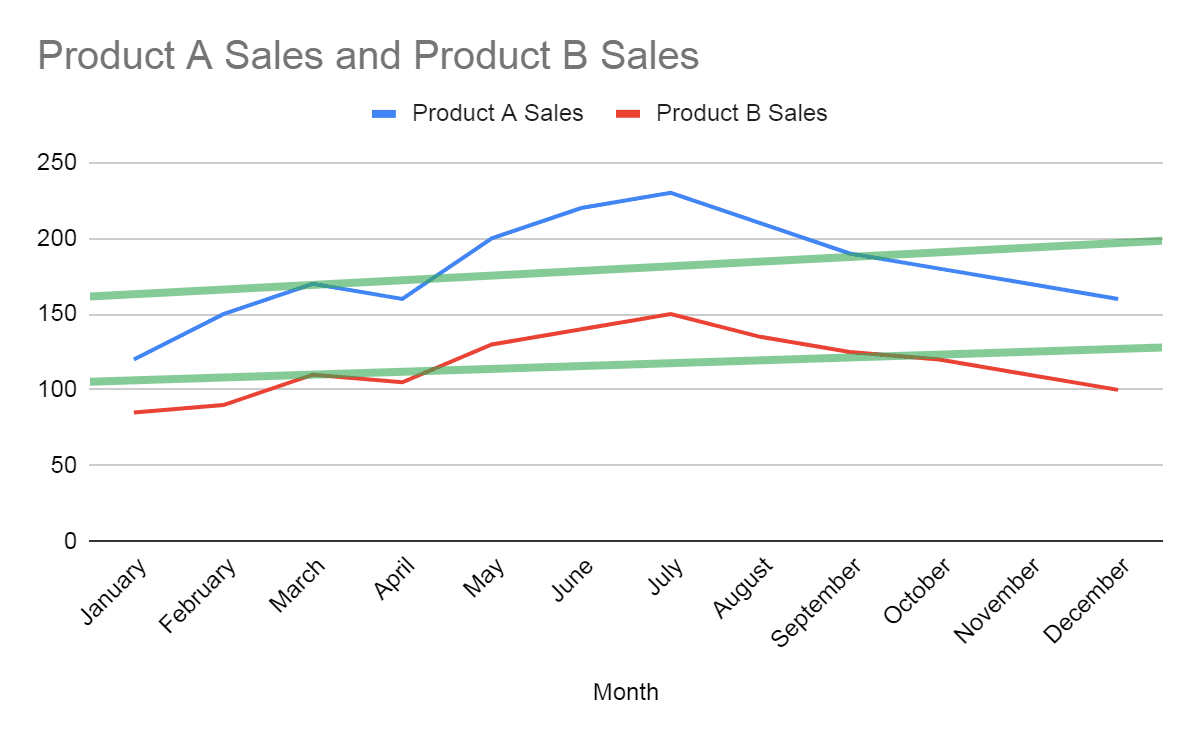
Well, there you have it folks, the basic steps of planning for a big project! The equation of the line of best fit will now appear on your chart to further help illustrate the movement of your Google Sheets values. Remember that you may change it or delete it easily by navigating to the Customise tab, and then the Series tab followed by the Line Fit tab again.
Tips for Ensuring Accuracy
Data Range: Ensure your data range is correct. The accuracy of the line of best fit depends on the quality and completeness of your data.
Outliers: Be mindful of outliers that can skew the trendline. Consider removing or accounting for outliers before adding a trendline. For detailed guidance on handling data issues, check out our guide on common challenges in Google Sheets.
Equation Interpretation: If you display the equation on the chart, double-check that it matches the expected trend. This is crucial if you're using the line of best fit for predictions.
Conclusion
Anyone who works with data should know how to add a line of best fit in Google Sheets. Whether you need accurate calculations for forecasting or a quick visual of data trends, mastering this skill will enhance your data analysis capabilities. Explore different methods to find what works best for your needs, and don’t hesitate to adjust the trendline for greater accuracy. Remember, Google Sheets offers a flexible platform for all your data analysis tasks, whether you're creating custom dashboards or connecting various data sources.
Say Goodbye to Tedious Data Exports! 🚀
Are you tired of the hassle of manually moving data from various tools into Google Sheets? Superjoin has a solution for you.
Superjoin is a Google Sheets add-on that automatically connects your favourite SaaS tools to your spreadsheets. It pulls data directly into Google Sheets, allowing you to create reports that update themselves without any manual work on your part.
Making wise judgements in Google Sheets depends on the ability to see trends, hence data visualisation is absolutely important. Learning how to add a line of best fit to your scatter plots or charts will help you to accomplish this most efficiently. Whether your analysis is of sales data, performance tracking, or future trend prediction, knowing how to properly apply and evaluate a line of best fit will be quite helpful. This blog will walk you through adding a line of best fit in Google Sheets and offer tips on maintaining accuracy.
What is The Line of Best Fit
On a scatter chart, the line of best fit, or trend line, is a straight line that represents the data. It minimizes the distance of each data point from itself, making it an excellent tool for estimating future values based on past performance. For more advanced customization of your charts, you can explore creating custom reports in Google Sheets to better visualize and analyze your data.
How to Add a Line of Best Fit in Google Sheets
There are several ways to add a line of best fit in Google Sheets. Below are the most common methods:
Built-in Chart Tools
Create a Chart: First, select your data range. Then, navigate to "Insert" > "Chart". This will create a default chart based on your data. If you're working with large datasets, consider connecting an external data source to keep your data up-to-date.
This will create a default chart based on your data.
Customise the Chart: Click on the chart, and select "Customise" from the chart editor on the right.
Add a Trendline: Under the "Series" section, you will find the option to add a “Trend line”. Select "Linear" to create a straight line of best fit.
Adjust Settings: Customise the trendline by adjusting its colour, opacity, and thickness. You can also display the equation on the chart, which is useful for precise predictions.
Well, there you have it folks, the basic steps of planning for a big project! The equation of the line of best fit will now appear on your chart to further help illustrate the movement of your Google Sheets values. Remember that you may change it or delete it easily by navigating to the Customise tab, and then the Series tab followed by the Line Fit tab again.
Tips for Ensuring Accuracy
Data Range: Ensure your data range is correct. The accuracy of the line of best fit depends on the quality and completeness of your data.
Outliers: Be mindful of outliers that can skew the trendline. Consider removing or accounting for outliers before adding a trendline. For detailed guidance on handling data issues, check out our guide on common challenges in Google Sheets.
Equation Interpretation: If you display the equation on the chart, double-check that it matches the expected trend. This is crucial if you're using the line of best fit for predictions.
Conclusion
Anyone who works with data should know how to add a line of best fit in Google Sheets. Whether you need accurate calculations for forecasting or a quick visual of data trends, mastering this skill will enhance your data analysis capabilities. Explore different methods to find what works best for your needs, and don’t hesitate to adjust the trendline for greater accuracy. Remember, Google Sheets offers a flexible platform for all your data analysis tasks, whether you're creating custom dashboards or connecting various data sources.
Say Goodbye to Tedious Data Exports! 🚀
Are you tired of the hassle of manually moving data from various tools into Google Sheets? Superjoin has a solution for you.
Superjoin is a Google Sheets add-on that automatically connects your favourite SaaS tools to your spreadsheets. It pulls data directly into Google Sheets, allowing you to create reports that update themselves without any manual work on your part.
FAQs
What types of trendlines can I create in Google Sheets?
What types of trendlines can I create in Google Sheets?
How do I interpret the slope of the trendline?
How do I interpret the slope of the trendline?
Can I add multiple trendlines to a single chart?
Can I add multiple trendlines to a single chart?
Automatic Data Pulls
Visual Data Preview
Set Alerts
other related blogs
Try it now