RevOps
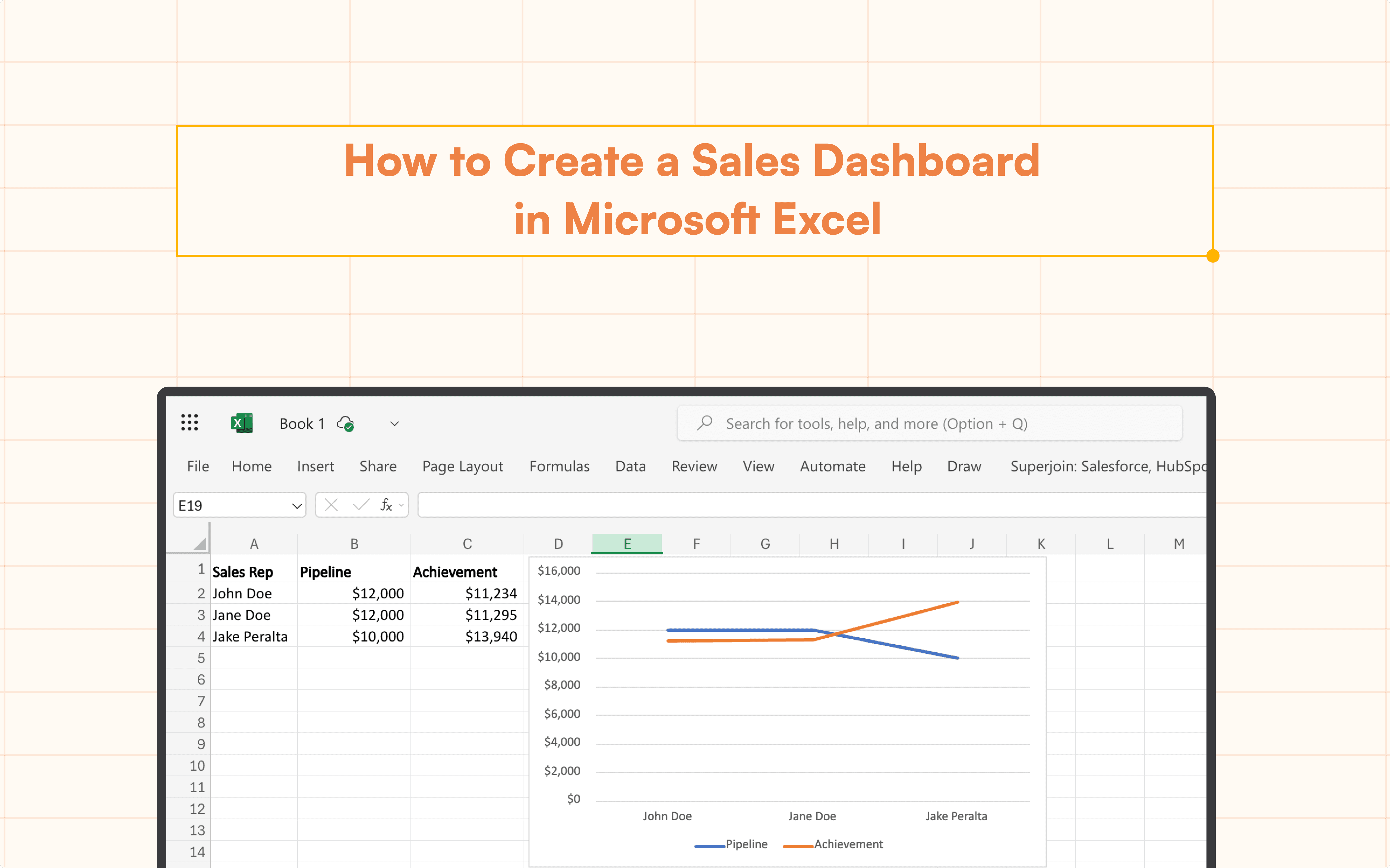
How to Create a Sales Dashboard in Microsoft Excel (4 Steps)
Create a powerful sales dashboard in Microsoft Excel! This guide covers sales dashboards, using Superjoin for import and crafting interactive visualizations.
Table of Contents
Success in the fast-paced world of sales depends on maintaining a close eye on important KPIs. Your hidden weapon could be a well-designed sales dashboard that gives you a quick and easy-to-read summary of your sales performance. This tutorial goes into great detail on how to create a dynamic sales dashboard in Excel, a widely accessible and cost-free program that enables you to efficiently visualize your sales data.
What is an Excel Sales Dashboard?
By combining important metrics and trends into a single, user-friendly Excel interface, an Excel sales dashboard provides a visual depiction of your sales success. It serves as a focal point, enabling you to monitor your progress toward objectives, pinpoint areas in need of development, and make informed decisions to maximize your sales approach.
In Excel, creating a sales dashboard entails arranging and showcasing important data, but what if you're handling huge datasets from various sources? By integrating Hubspot with Excel, you can ensure that your metrics are always current without the need for human entry by pulling real-time sales data straight from your Hubspot into your dashboard. By automating the data sync process, this connection improves your Excel experience, particularly for companies that depend on Hubspot for customer and sales data.
A Step-by-Step Guide to Create an Excel Sales Dashboard
Step 1: Importing Data Using Superjoin
While you can manually enter data into Excel, consider using Superjoin for a more streamlined approach, especially if you're working with data from external sources like CRM systems. Superjoin is a free add-on for Excel that simplifies data import from various platforms.
For detailed instructions on connecting HubSpot to Excel, please refer to our blog, "How to Integrate Superjoin on Microsoft Excel".
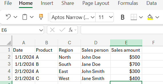
Step 2: Organize Data with Formulas
Create Summary Tables:
Create another sheet titled "Summary".
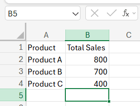
Use formulas to summarize the data. For instance, to calculate total sales by product:
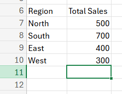
Calculate Total Sales by Region:
To calculate total sales by region, use:
Salesperson Performance:
For total sales by salesperson:

Step 3: Create Visualizations
Create Charts:
Go back to your "Sales Data" or "Summary" sheet.
Select the data you want to visualize.
Go to Insert > Chart.
In the Chart Editor, choose the type of chart that best represents your data (e.g., bar chart, pie chart, line chart).
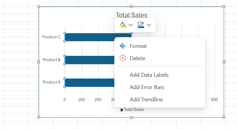
Configure Charts:
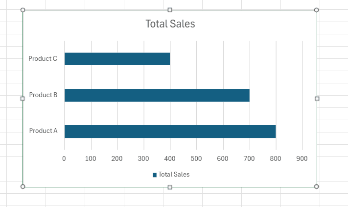
For a Total Sales by Product bar chart:
Select the range A2:B5 from the Summary sheet.
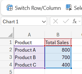
Insert a bar chart and customize it with titles, colors, and labels.
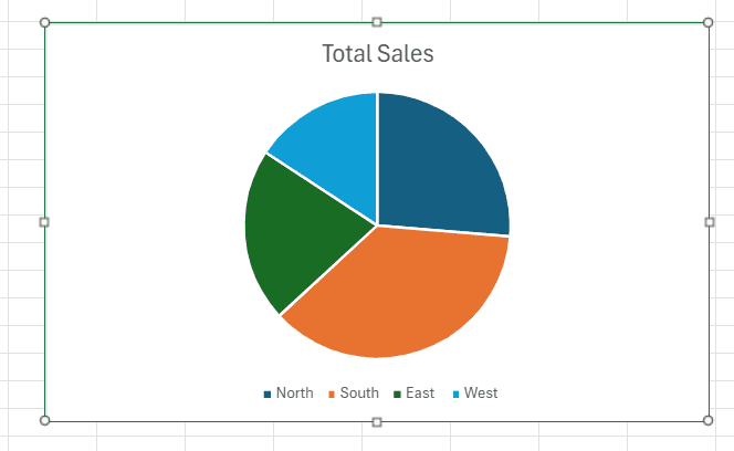
For a Sales by Region pie chart:
Select the range A6:B10 from the Summary sheet.
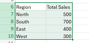
Insert a pie chart and customize it accordingly.
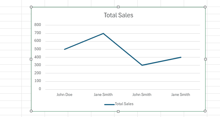
For a Sales by SalesPerson line chart:
Select the range A12:B16 from the Summary sheet.
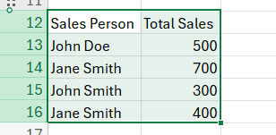
Insert a line chart and customize it accordingly.
Step 4: Customize and Share
Customize Dashboard:
Add titles, labels, and color-coding to make the dashboard easy to understand.
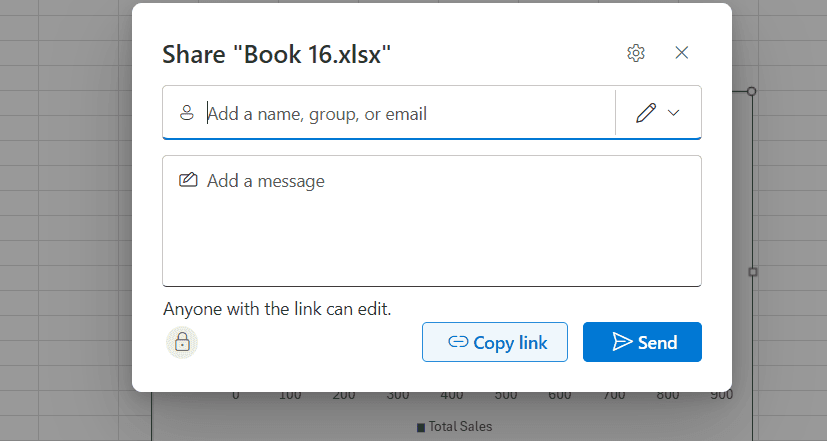
Share the Dashboard:
Go to File > Share > Share with others.
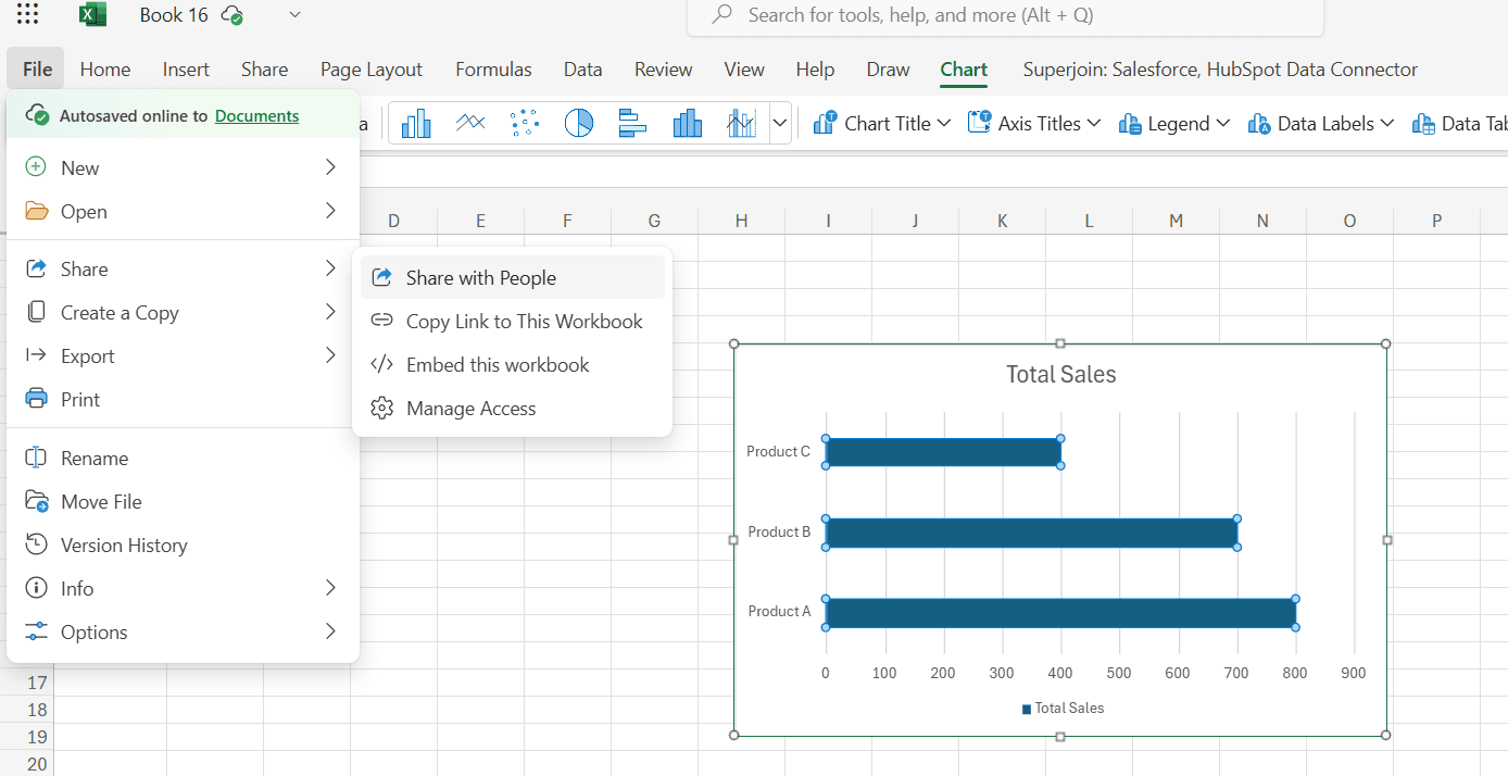
Enter the email addresses of people you want to share the dashboard with and set their access permissions (e.g., view-only, edit).
Conclusion
Having a clear and simple perspective of your performance is essential in today's data-driven sales environment. You can evaluate trends, pinpoint areas for improvement, and make well-informed decisions to maximize your sales strategy with the help of a well-designed Excel sales dashboard.
You may use Excel's accessibility and ease of use to develop a potent Excel sales dashboard by following the instructions in this article. Keep in mind to prioritize the KPIs that are most pertinent to your particular objectives, display information in an understandable and visible manner, and update data often.
Even though Excel is a powerful tool for many firms, you can select the best strategy for your requirements by being aware of potential drawbacks including poor data quality and restricted communication.
Therefore, make the most of Excel's capabilities and provide your sales staff with an engaging and educational dashboard. As you acquire insightful knowledge and make data-driven decisions that propel success, observe your sales performance rise.
Say Goodbye To Tedious Data Exports!
Are you tired of spending hours manually exporting CSVs from different tools and importing them into Excel?
Superjoin is a data connector for Excel that connects your favorite SaaS tools to Excel automatically. You can get data from these platforms into Excel automatically to build reports that update automatically.
Bid farewell to tedious exports and repetitive tasks. With Superjoin, you can add 1 additional day to your week. Try Superjoin for free or schedule a demo.
Success in the fast-paced world of sales depends on maintaining a close eye on important KPIs. Your hidden weapon could be a well-designed sales dashboard that gives you a quick and easy-to-read summary of your sales performance. This tutorial goes into great detail on how to create a dynamic sales dashboard in Excel, a widely accessible and cost-free program that enables you to efficiently visualize your sales data.
What is an Excel Sales Dashboard?
By combining important metrics and trends into a single, user-friendly Excel interface, an Excel sales dashboard provides a visual depiction of your sales success. It serves as a focal point, enabling you to monitor your progress toward objectives, pinpoint areas in need of development, and make informed decisions to maximize your sales approach.
In Excel, creating a sales dashboard entails arranging and showcasing important data, but what if you're handling huge datasets from various sources? By integrating Hubspot with Excel, you can ensure that your metrics are always current without the need for human entry by pulling real-time sales data straight from your Hubspot into your dashboard. By automating the data sync process, this connection improves your Excel experience, particularly for companies that depend on Hubspot for customer and sales data.
A Step-by-Step Guide to Create an Excel Sales Dashboard
Step 1: Importing Data Using Superjoin
While you can manually enter data into Excel, consider using Superjoin for a more streamlined approach, especially if you're working with data from external sources like CRM systems. Superjoin is a free add-on for Excel that simplifies data import from various platforms.
For detailed instructions on connecting HubSpot to Excel, please refer to our blog, "How to Integrate Superjoin on Microsoft Excel".
Step 2: Organize Data with Formulas
Create Summary Tables:
Create another sheet titled "Summary".
Use formulas to summarize the data. For instance, to calculate total sales by product:
Calculate Total Sales by Region:
To calculate total sales by region, use:
Salesperson Performance:
For total sales by salesperson:
Step 3: Create Visualizations
Create Charts:
Go back to your "Sales Data" or "Summary" sheet.
Select the data you want to visualize.
Go to Insert > Chart.
In the Chart Editor, choose the type of chart that best represents your data (e.g., bar chart, pie chart, line chart).
Configure Charts:
For a Total Sales by Product bar chart:
Select the range A2:B5 from the Summary sheet.
Insert a bar chart and customize it with titles, colors, and labels.
For a Sales by Region pie chart:
Select the range A6:B10 from the Summary sheet.
Insert a pie chart and customize it accordingly.
For a Sales by SalesPerson line chart:
Select the range A12:B16 from the Summary sheet.
Insert a line chart and customize it accordingly.
Step 4: Customize and Share
Customize Dashboard:
Add titles, labels, and color-coding to make the dashboard easy to understand.
Share the Dashboard:
Go to File > Share > Share with others.
Enter the email addresses of people you want to share the dashboard with and set their access permissions (e.g., view-only, edit).
Conclusion
Having a clear and simple perspective of your performance is essential in today's data-driven sales environment. You can evaluate trends, pinpoint areas for improvement, and make well-informed decisions to maximize your sales strategy with the help of a well-designed Excel sales dashboard.
You may use Excel's accessibility and ease of use to develop a potent Excel sales dashboard by following the instructions in this article. Keep in mind to prioritize the KPIs that are most pertinent to your particular objectives, display information in an understandable and visible manner, and update data often.
Even though Excel is a powerful tool for many firms, you can select the best strategy for your requirements by being aware of potential drawbacks including poor data quality and restricted communication.
Therefore, make the most of Excel's capabilities and provide your sales staff with an engaging and educational dashboard. As you acquire insightful knowledge and make data-driven decisions that propel success, observe your sales performance rise.
Say Goodbye To Tedious Data Exports!
Are you tired of spending hours manually exporting CSVs from different tools and importing them into Excel?
Superjoin is a data connector for Excel that connects your favorite SaaS tools to Excel automatically. You can get data from these platforms into Excel automatically to build reports that update automatically.
Bid farewell to tedious exports and repetitive tasks. With Superjoin, you can add 1 additional day to your week. Try Superjoin for free or schedule a demo.
FAQs
Is Excel powerful enough for complex sales dashboards?
Is Excel powerful enough for complex sales dashboards?
What data sources can I connect to Excel for my dashboard?
What data sources can I connect to Excel for my dashboard?
Can multiple people collaborate on the sales dashboard in Excel?
Can multiple people collaborate on the sales dashboard in Excel?
Automatic Data Pulls
Visual Data Preview
Set Alerts

Try it now