Google Sheets Tutorial
How to Make a Bell Curve in Google Sheets
Learn how to make a bell curve in Google Sheets with this step-by-step guide. Explore different methods and tips for creating a bell curve.
Table of Contents
Understanding how to visualize data effectively is crucial in today's data-driven world. One of the most common tools for representing data distributions is the bell curve. If you're looking to bring statistical analysis to life, learning how to make a bell curve in Google Sheets can be a game-changer. This visual representation helps you understand data patterns, deviations, and averages, making it a valuable skill for both students and professionals. In this guide, we’ll explore several methods to create a bell curve, covering the essentials that cater to different user needs.
What is a Bell Curve?
A bell curve, also known as a normal distribution or Gaussian distribution, is a graph that represents data that clusters around a mean (average) value. The shape of the curve resembles a bell, with the highest point at the mean and tails that taper off on either side. This curve is widely used in statistics, finance, and various scientific fields to represent how data is distributed.
How to Make a Bell Curve in Google Sheets: Using Built-In Functions
Google Sheets offers robust tools to create a bell curve, utilizing its built-in functions for generating a dataset and visualizing it through charts. Here’s how you can do it:
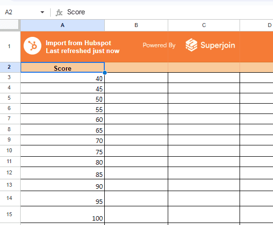
1. Prepare Your Data Set
To create a bell curve, you first need to generate a dataset that represents a normal distribution. You can use Google Sheets functions to simulate this data.
In column A, enter a series of numbers representing the mean values you want to analyze. For example, start from 40 and go up to 100, incrementing by 5.
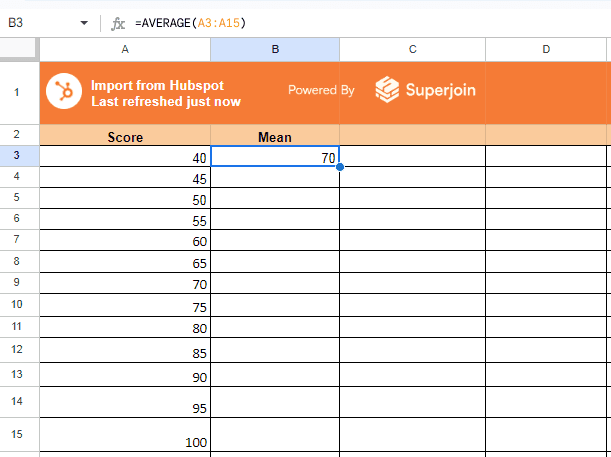
2. Calculate Mean and Standard Deviation
In column B, use the AVERAGE function to find the mean of your data. Enter your data values (e.g., test scores, sales figures) and calculate the average.
=AVERAGE(range)
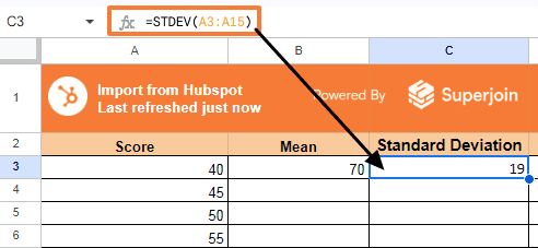
In column C, use the STDEV function to find the standard deviation.
=STDEV(range)
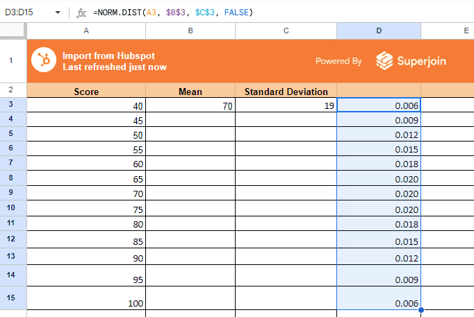
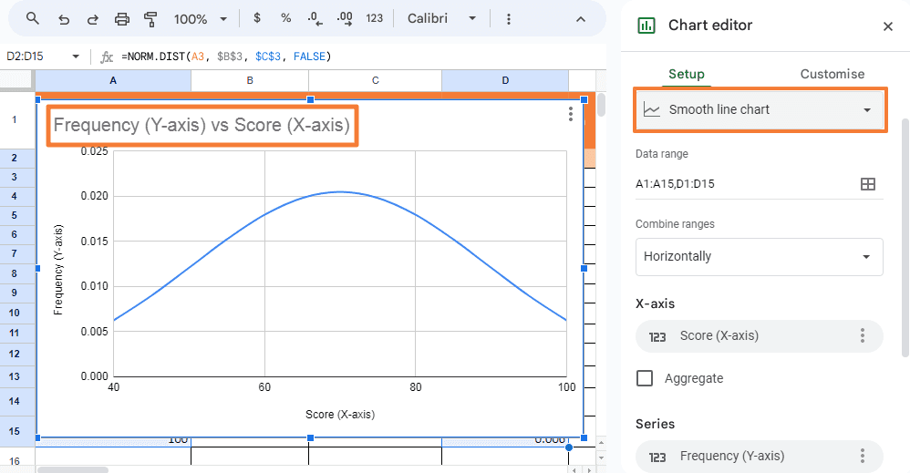
3. Use the NORM.DIST Function
In column D, apply the NORM.DIST function to calculate the normal distribution for each data point.
=NORM.DIST(A3, $B$3, $C$3, FALSE)
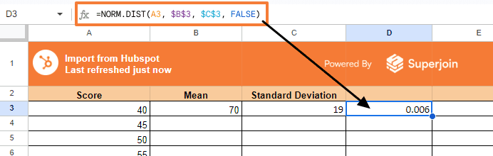
Drag the formula down to apply it to the entire data range.
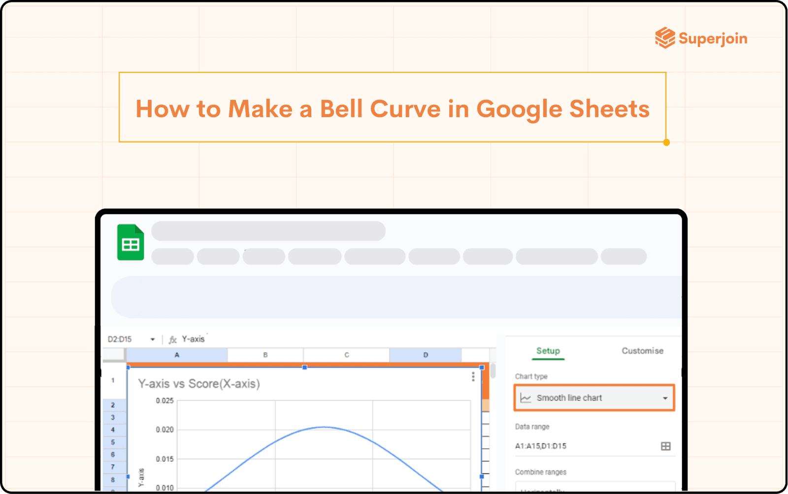
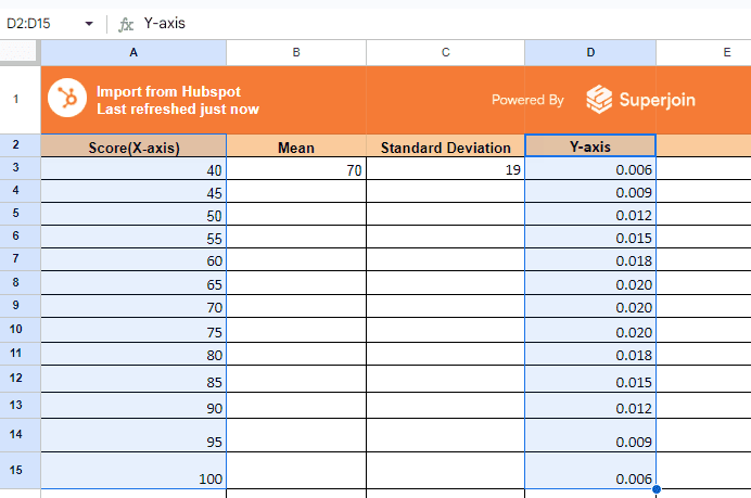
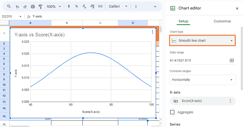
4. Create the Bell Curve Chart
Highlight the values in column A (x-axis) and column D (y-axis).
Go to the Insert menu and select Chart.
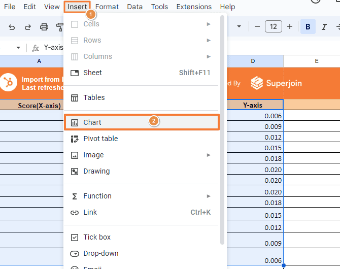
Choose a Scatter chart type and customize it with smooth lines to make it resemble a bell curve.
Using these steps, you’ve successfully learned how to make a bell curve in Google Sheets with basic data using built-in functions.
Fine-Tuning the Bell Curve Chart
After creating the initial bell curve, you might need to fine-tune it for clarity and presentation purposes:
Adjust the Chart Scale: Ensure the x-axis and y-axis scales accurately represent the data. Customize the axis values under the chart editor for a more visually appealing curve.
Smooth the Line: Use the chart editor’s customization options to add a smooth line effect. This creates a more typical bell curve appearance.
Label the Axes: Add labels to your chart’s axes to make the data representation clear. For example, the x-axis could represent the score, and the y-axis could represent frequency.
Benefits of Using a Bell Curve in Google Sheets
Creating a bell curve in Google Sheets helps visualize data distribution, making it easier to analyze patterns, trends, and outliers. This method is invaluable in various sectors, including education, finance, and marketing, where understanding data distributions can influence decision-making.
Common Pitfalls and Troubleshooting
Incorrect Formula Usage: Ensure you're using the correct syntax and parameters in functions like NORM.DIST. Errors here can skew the data representation.
Data Range Issues: Double-check that your formulas reference the correct data range. Mismatched ranges can lead to inaccuracies in the curve.
Chart Type Selection: If your curve doesn't look right, you might have chosen the wrong chart type. Ensure you're using a scatter chart with smooth lines.
Conclusion
Learning how to make a bell curve in Google Sheets opens up a new dimension of data analysis and visualization. Whether you're a student, educator, or professional, mastering this skill can significantly enhance your ability to present data insights clearly and effectively. By leveraging both built-in functions and add-ons like XLMiner, you can tailor your approach to fit your specific needs and data complexity. With these methods, creating and customizing a bell curve is straightforward, enabling you to represent data patterns with precision. By following this guide, you're now equipped to create and customize a bell curve in Google Sheets, enhancing your data analysis and presentation skills.
Say Goodbye to Tedious Data Exports! 🚀
Are you tired of the hassle of manually moving data from various tools into Google Sheets? Superjoin has a solution for you.
Superjoin is a Google Sheets add-on that automatically connects your favorite SaaS tools to your spreadsheets. It pulls data directly into Google Sheets, allowing you to create reports that update themselves without any manual work on your part.
Understanding how to visualize data effectively is crucial in today's data-driven world. One of the most common tools for representing data distributions is the bell curve. If you're looking to bring statistical analysis to life, learning how to make a bell curve in Google Sheets can be a game-changer. This visual representation helps you understand data patterns, deviations, and averages, making it a valuable skill for both students and professionals. In this guide, we’ll explore several methods to create a bell curve, covering the essentials that cater to different user needs.
What is a Bell Curve?
A bell curve, also known as a normal distribution or Gaussian distribution, is a graph that represents data that clusters around a mean (average) value. The shape of the curve resembles a bell, with the highest point at the mean and tails that taper off on either side. This curve is widely used in statistics, finance, and various scientific fields to represent how data is distributed.
How to Make a Bell Curve in Google Sheets: Using Built-In Functions
Google Sheets offers robust tools to create a bell curve, utilizing its built-in functions for generating a dataset and visualizing it through charts. Here’s how you can do it:
1. Prepare Your Data Set
To create a bell curve, you first need to generate a dataset that represents a normal distribution. You can use Google Sheets functions to simulate this data.
In column A, enter a series of numbers representing the mean values you want to analyze. For example, start from 40 and go up to 100, incrementing by 5.
2. Calculate Mean and Standard Deviation
In column B, use the AVERAGE function to find the mean of your data. Enter your data values (e.g., test scores, sales figures) and calculate the average.
=AVERAGE(range)
In column C, use the STDEV function to find the standard deviation.
=STDEV(range)
3. Use the NORM.DIST Function
In column D, apply the NORM.DIST function to calculate the normal distribution for each data point.
=NORM.DIST(A3, $B$3, $C$3, FALSE)
Drag the formula down to apply it to the entire data range.
4. Create the Bell Curve Chart
Highlight the values in column A (x-axis) and column D (y-axis).
Go to the Insert menu and select Chart.
Choose a Scatter chart type and customize it with smooth lines to make it resemble a bell curve.
Using these steps, you’ve successfully learned how to make a bell curve in Google Sheets with basic data using built-in functions.
Fine-Tuning the Bell Curve Chart
After creating the initial bell curve, you might need to fine-tune it for clarity and presentation purposes:
Adjust the Chart Scale: Ensure the x-axis and y-axis scales accurately represent the data. Customize the axis values under the chart editor for a more visually appealing curve.
Smooth the Line: Use the chart editor’s customization options to add a smooth line effect. This creates a more typical bell curve appearance.
Label the Axes: Add labels to your chart’s axes to make the data representation clear. For example, the x-axis could represent the score, and the y-axis could represent frequency.
Benefits of Using a Bell Curve in Google Sheets
Creating a bell curve in Google Sheets helps visualize data distribution, making it easier to analyze patterns, trends, and outliers. This method is invaluable in various sectors, including education, finance, and marketing, where understanding data distributions can influence decision-making.
Common Pitfalls and Troubleshooting
Incorrect Formula Usage: Ensure you're using the correct syntax and parameters in functions like NORM.DIST. Errors here can skew the data representation.
Data Range Issues: Double-check that your formulas reference the correct data range. Mismatched ranges can lead to inaccuracies in the curve.
Chart Type Selection: If your curve doesn't look right, you might have chosen the wrong chart type. Ensure you're using a scatter chart with smooth lines.
Conclusion
Learning how to make a bell curve in Google Sheets opens up a new dimension of data analysis and visualization. Whether you're a student, educator, or professional, mastering this skill can significantly enhance your ability to present data insights clearly and effectively. By leveraging both built-in functions and add-ons like XLMiner, you can tailor your approach to fit your specific needs and data complexity. With these methods, creating and customizing a bell curve is straightforward, enabling you to represent data patterns with precision. By following this guide, you're now equipped to create and customize a bell curve in Google Sheets, enhancing your data analysis and presentation skills.
Say Goodbye to Tedious Data Exports! 🚀
Are you tired of the hassle of manually moving data from various tools into Google Sheets? Superjoin has a solution for you.
Superjoin is a Google Sheets add-on that automatically connects your favorite SaaS tools to your spreadsheets. It pulls data directly into Google Sheets, allowing you to create reports that update themselves without any manual work on your part.
FAQs
Can I create a bell curve in Google Sheets without using add-ons?
Can I create a bell curve in Google Sheets without using add-ons?
What is the significance of a bell curve in data analysis?
What is the significance of a bell curve in data analysis?
Can I customize the appearance of the bell curve chart in Google Sheets?
Can I customize the appearance of the bell curve chart in Google Sheets?
Automatic Data Pulls
Visual Data Preview
Set Alerts
other related blogs
Try it now