RevOps
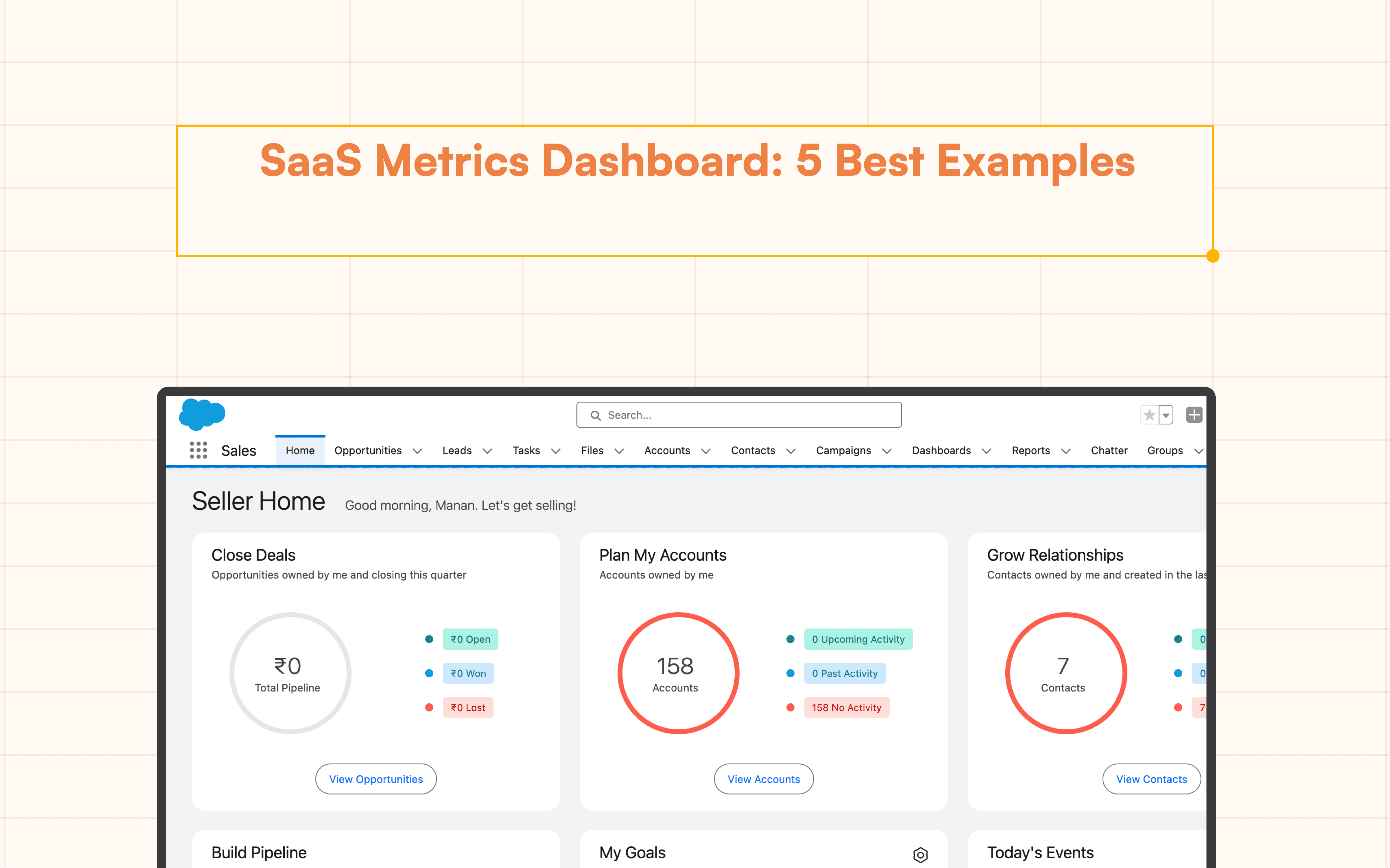
Sales Pipeline Dashboard in Google Sheets: Ultimate Guide
Build a sales pipeline dashboard with our sales pipeline template in Google Sheets. Streamline your process and boost productivity.
Table of Contents
A sales pipeline dashboard is an essential tool for sales teams to manage and track their sales processes effectively. It provides a visual representation of your sales funnel, from lead generation to closing deals. While there are many tools available for creating sales pipeline dashboards, Google Sheets stands out due to its accessibility, flexibility, and powerful features. In this ultimate guide, we will walk you through creating a comprehensive sales pipeline dashboard in Google Sheets.
Why Use Google Sheets for Sales Pipeline?
Google Sheets offers several advantages for managing your sales pipeline:
Accessibility: As a cloud-based tool, Google Sheets is accessible from anywhere, on any device.
Collaboration: Multiple team members can collaborate in real time, making it easier to update and share information.
Customizability: You can tailor your sales pipeline to fit your specific needs with customizable templates and functions.
Integration: Google Sheets can integrate with other tools and platforms, enhancing its functionality. For instance, you can seamlessly connect data from PostgreSQL to Google Sheets to ensure your sales dashboard reflects real-time updates from your database. This integration helps you consolidate and analyze data across various sources efficiently.
Setting Up Your Sales Pipeline Dashboard
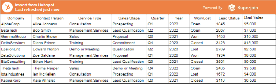
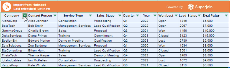
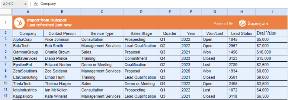
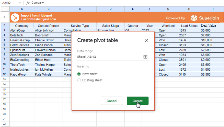
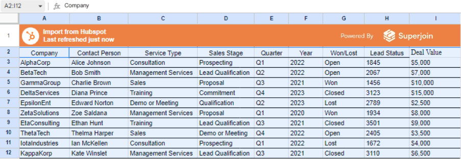
To illustrate how to make a Sales Pipeline Dashboard in Google Sheets, let's work with a sample dataset. The dataset, shown below, is extracted from HubSpot and imported into Google Sheets using Superjoin.

Here are the steps to automate HubSpot with Google Sheets using Superjoin:
Automate HubSpot Data Exports to Google Sheets with Superjoin
HubSpot's default reporting system lacks built-in scheduling for exports. This means manually exporting reports at regular intervals and relying on email reminders for new data. This approach can be inefficient and lead to outdated information.
Superjoin offers a solution to automate HubSpot report exports to Google Sheets. Here's how it works:
Install Superjoin:
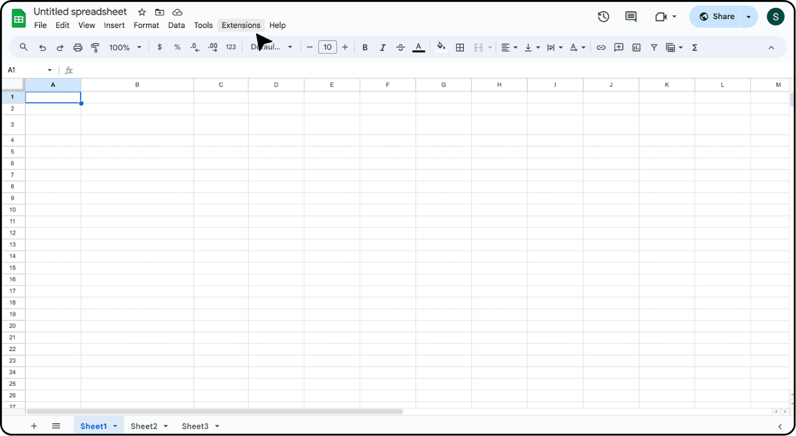
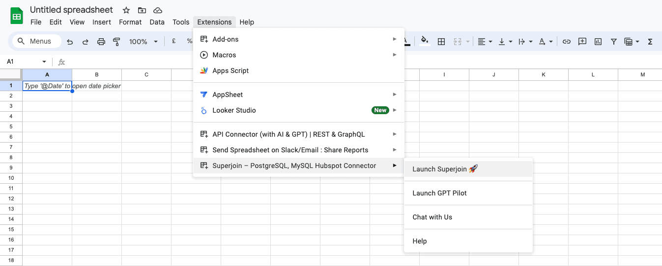
Go to your Google Sheets account and access the Extensions menu.
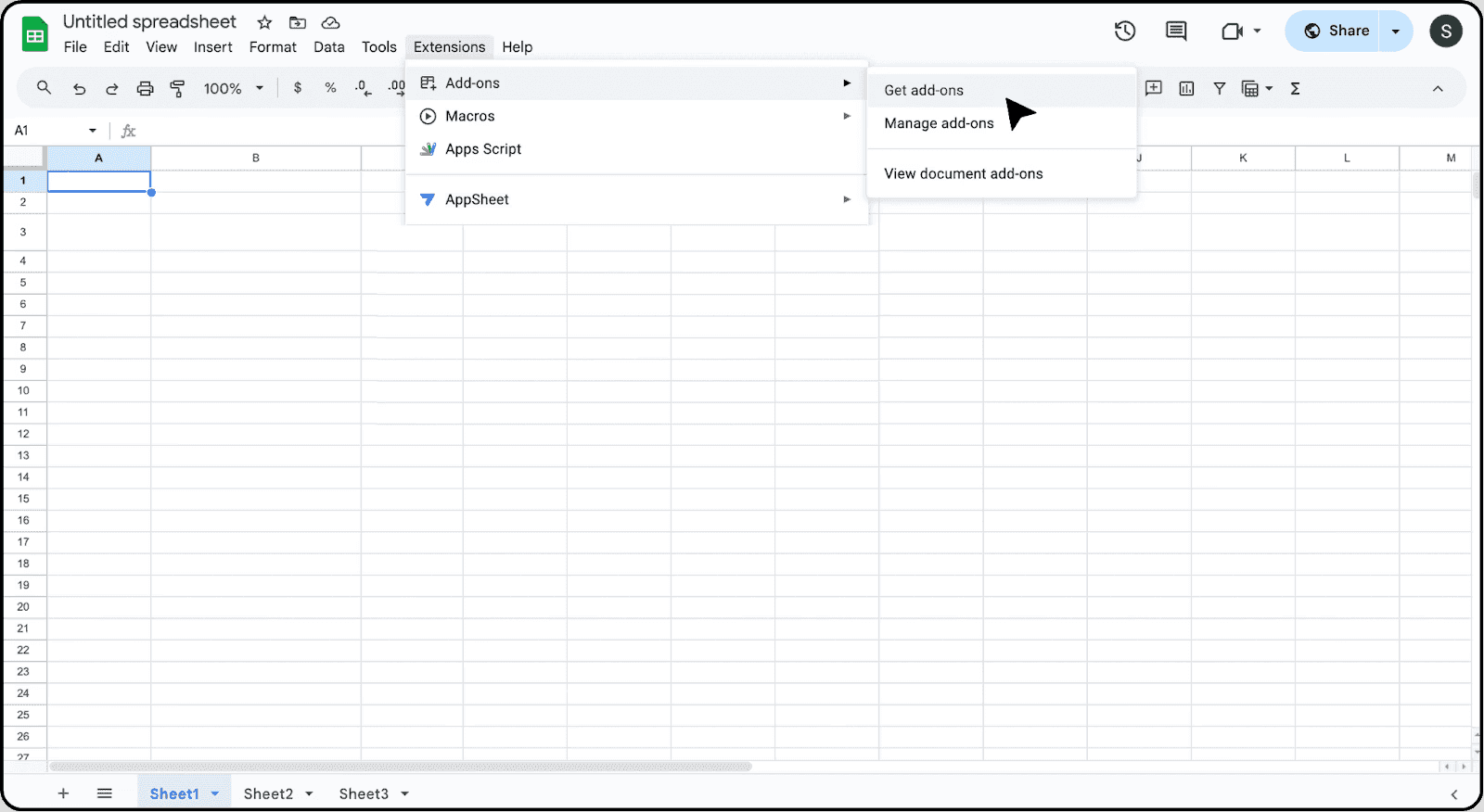
Select "Add-ons" > “Get add ons” to open the Google Workspace Marketplace.
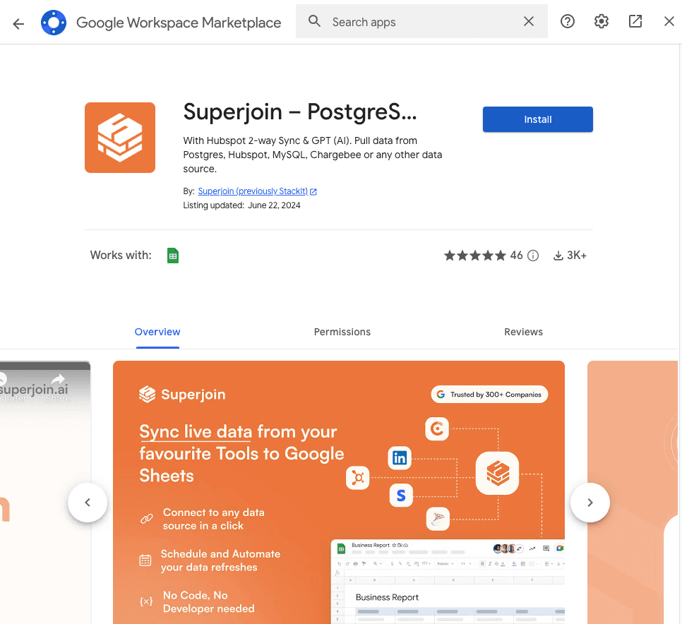
Search for "Superjoin" and install the app.
Connect Superjoin to HubSpot:
Launch Superjoin from the Extensions > Add-ons option>Launch Superjoin.
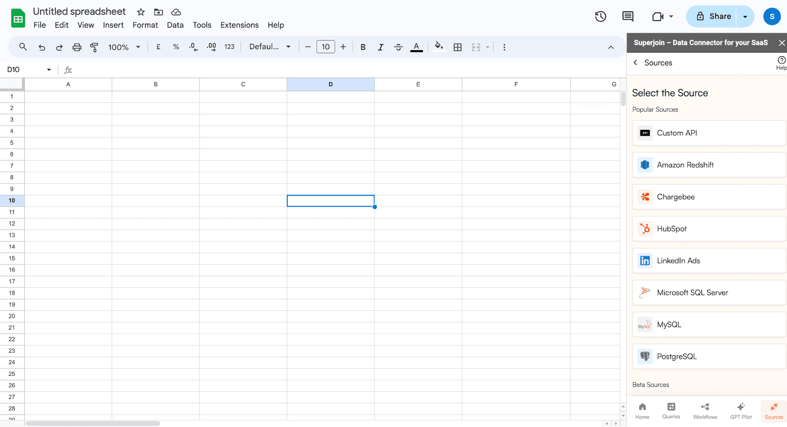
Choose HubSpot from the list of available Connections.
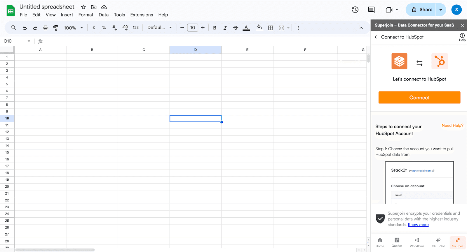
Click on Connect: Click on Connect and follow the on-screen instructions to connect your HubSpot account to Google Sheets seamlessly.
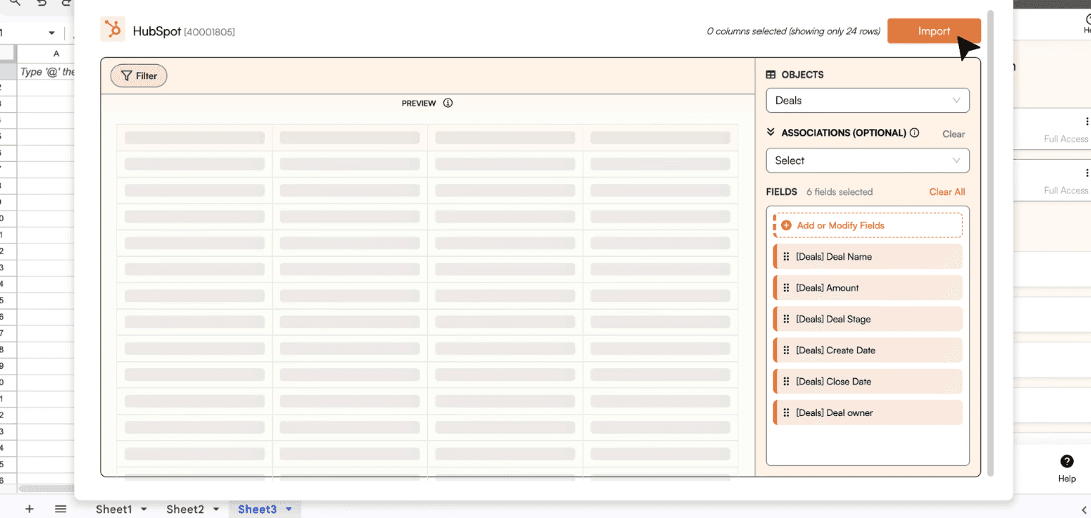
Choose Data Objects: Select the specific data objects you wish to import from HubSpot, such as Deals data.
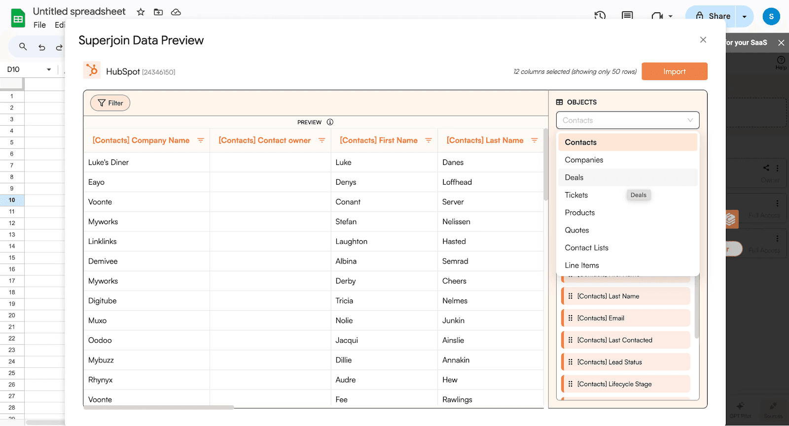
Customize Field Selection: Customize your data import by choosing which fields to include and preview your data visually before importing.
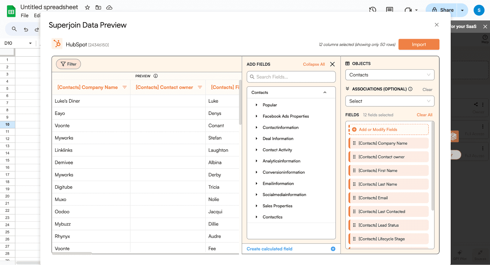
Initiate Import: Click on Import, and watch as your HubSpot data populates your Google spreadsheet instantly.
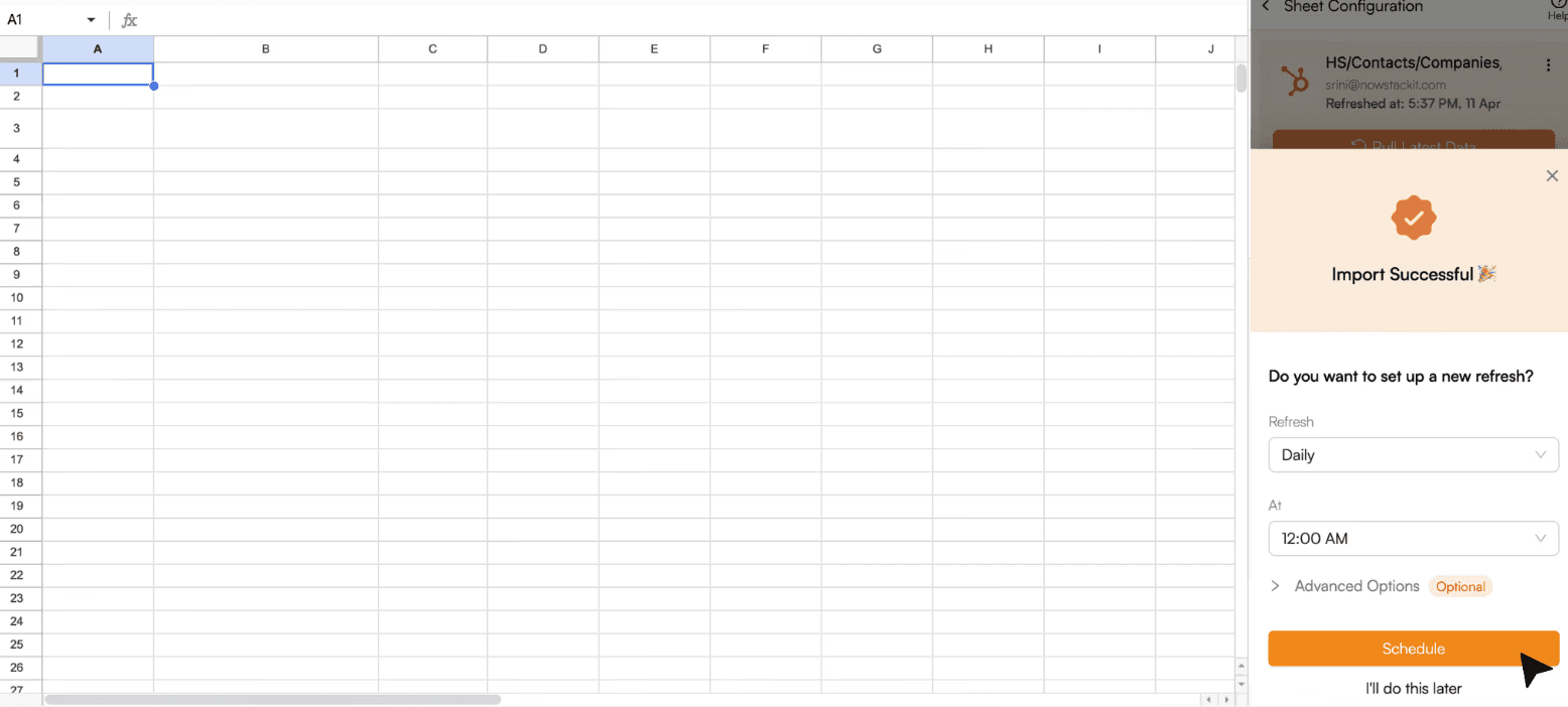
Set up a Schedule: Superjoin lets you refresh your imported data instantly with one click or set it to auto-refresh on a pre-set schedule.
The data will be seamlessly imported into your Google Sheet.
Benefits of Superjoin:
Eliminates manual exports: No more repetitive exporting of reports from HubSpot.
Ensures data accuracy: Always work with the latest information from HubSpot.
Saves time and effort: Automates data transfer and scheduling.
Improves data analysis: Streamlines the process for analyzing HubSpot data in Google Sheets.
Limitations of Superjoin:
Free Plan Limitations: Although Superjoin provides a free plan, it imposes restrictions on the number of connections you can establish. Please review the plan details here.
Superjoin streamlines the HubSpot to Google Sheets data flow, saving you time and ensuring you always have access to the most up-to-date information.
Open Deals and Closed Deals with Values
Step1: Import Dataset into Google Sheets
Open Google Sheets and create a new spreadsheet.
Enter the Data into the spreadsheet with the following columns:
Company
Contact Person
Service Type
Sales Stage
Quarter
Year
Won/Lost
Lead Status
Deal Value
Step 2: Calculations for Open and Closed Deals
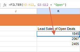
Open Deals
Filter Data: Use Google Sheets functions to filter for open deals.
Filter Function: =FILTER(H3:H12, G3:G12 = "Open") (assuming data starts from row 3 to 12).
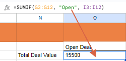
Sum of Open Deals: Calculate the total value of open deals.
SUMIF Function: =SUMIF(G3:G12, "Open", I3:I12)
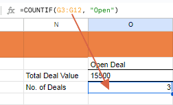
Number of Open Deals: Calculate the total no. of open deals.
COUNTIF Function: =COUNTIF( G3:G12, “Open”)
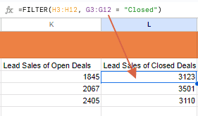
Closed Deals
Filter Data: Use Google Sheets functions to filter for closed deals.
Filter Function: =FILTER(H3:H12, G3:G12 = "Closed")
Sum of Closed Deals: Calculate the total value of closed deals.
SUMIF Function: =SUMIF(G3:G12, "Closed", I3:I12)
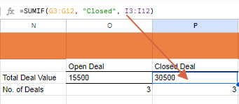
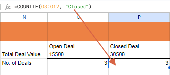
Number of Closed Deals: Calculate the total no. of closed deals.
COUNTIF Function: =COUNTIF( G3:G12, “Closed”)
After performing the above steps you will get these tables:
Open Deals by Stage
Step 1: Filter for Open Deals
Select Your Data Range: Highlight the range of your data including the headers, for example, A2:I12.
Create a Filter:
Go to the menu and select Data > Create a filter.
A filter icon will appear in each header cell.
Apply the Filter:
Click on the filter icon in the "Won/Lost" header cell (Column G).
Uncheck all options except for "Open" and click OK.
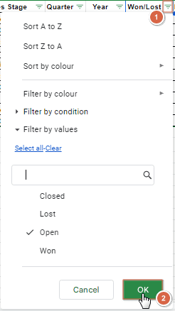
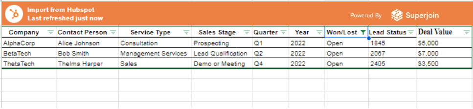
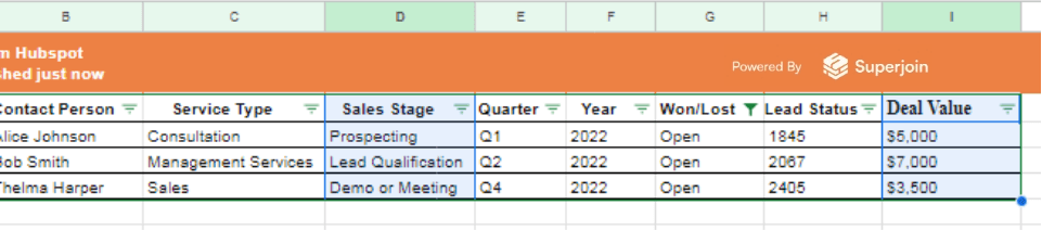
Now your data will only show rows where the "Won/Lost" status is "Open".
Step 2: Summarize Open Deals by Stage
Create a Pivot Table:
Select your data range.
Go to Insert > Pivot table.
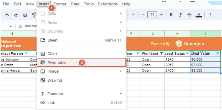
Set up the pivot table to summarize the open deals by "Sales Stage".
Configure the Pivot Table:
Rows: Add "Sales Stage".
Values: Add "Deal Value" and set it to SUM.
Filter: Add "Won/Lost" and filter to include only "Open".
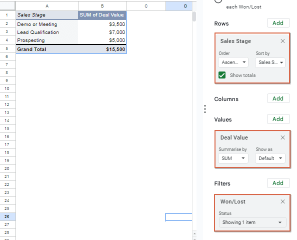
Step 3: Organize the Data for Display
Here’s how to organize the data similarly to the example image:
Deals Won and Lost by Segment
Step 1: Create Pivot Tables
Select Your Data Range: Highlight the range of your data including the headers, for example, A2:I12.
Create a Pivot Table:
Go to the menu and select Insert > Pivot table.
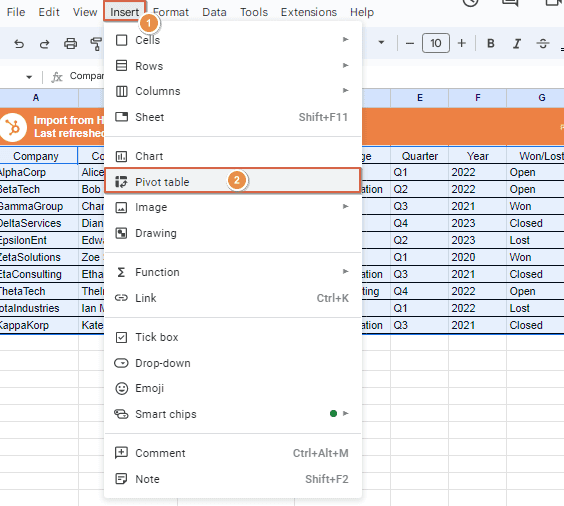
A menu will appear, Click on Create.
A new sheet will be created with the pivot table editor.
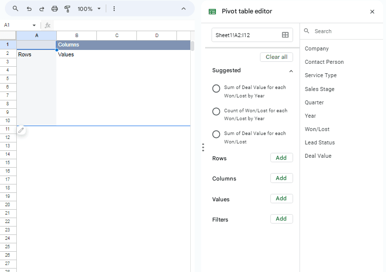
Set Up the Pivot Table for Deals Lost and Won:
Rows: Add "Won/Lost".
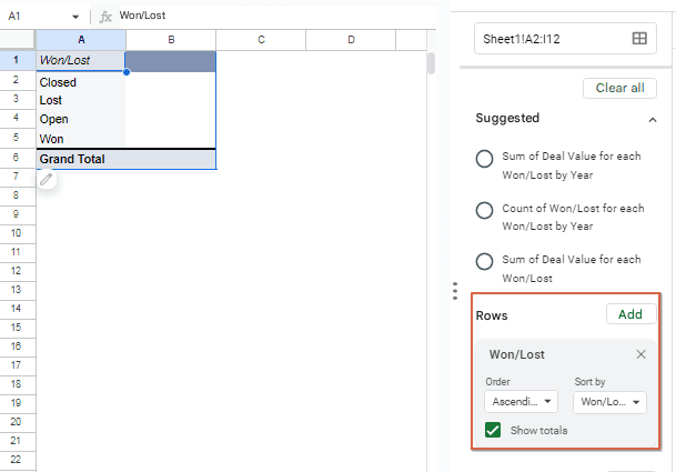
Values: Add "Deal Value" and set it to SUM.
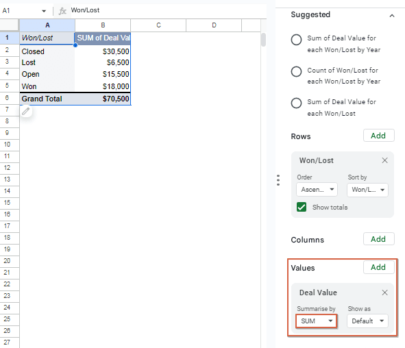
Values: Add "Company" (to count the number of deals) and set it to COUNTA.
Step 2: Create Another Pivot Table for Service Type
Select Your Data Range:
Highlight the range of your data including the headers.
Create a Pivot Table:
Go to the menu and select Insert > Pivot table.
A new sheet will be created with the pivot table editor.
Set Up the Pivot Table for Service Type:
Rows: Add "Service Type".
Values: Add "Deal Value" and set it to SUM.
Values: Add "Company" (to count the number of deals) and set it to COUNTA.
Step 3: Organize and Format the Data
Combine the Pivot Table Data:
Create a new sheet or section in your existing sheet to combine the summarized data from both pivot tables.
Organize the Data into a Summary Table:
The Power of Graphical Visualization
Data. Data everywhere. In the world of sales, you're constantly bombarded with numbers: targets, quotas, individual rep performance, product breakdowns. It's enough to make your head spin! But what if there was a way to transform this data overload into actionable insights, a way to see your sales success story unfold visually?
Enter the magic of graphical visualization. By turning those numbers into charts, graphs, and dashboards, you can unlock a deeper understanding of your sales performance and make data-driven decisions that propel you forward.
Suggested reads- How to Analyze Sales Rep Performance in Google Sheets
Why Visualize Your Sales?
Imagine trying to decipher a symphony by reading sheet music alone. Now imagine listening to that same symphony – the highs and lows, the crescendos and decrescendos, all come alive. Visualization is to data what music is to sheet music. It brings your sales story to life, revealing trends, patterns, and outliers that might otherwise go unnoticed.
Here's how visualization can benefit your sales team:
Spot Trends: Line charts can expose seasonal fluctuations or track progress towards goals. Identify peaks and valleys to optimize sales strategies throughout the year.
Benchmark Performance: Compare sales figures across different product categories, regions, or sales reps with bar graphs. See who's crushing it and who needs extra support.
Uncover Relationships: Scatter plots can reveal hidden connections between variables. Does marketing spend correlate with sales in a particular region? Visualization can help you answer these questions.
Boost Communication: A well-designed sales dashboard can be a powerful communication tool. Present data to stakeholders in a clear, concise way and secure buy-in for new initiatives.
Charts
The following data visualization presents the success rate of projects, categorized as won or lost.
Bar Charts: Perfect for comparing categories or performance metrics.
Steps to Insert a Bar Chart to your Sheet:
Select desired range of data.
Go to the menu and select Insert > Charts.
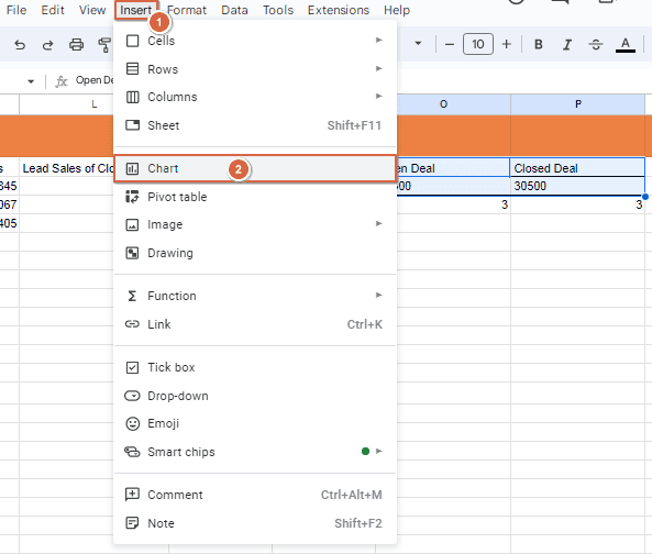
Select a Bar Chart from the list.
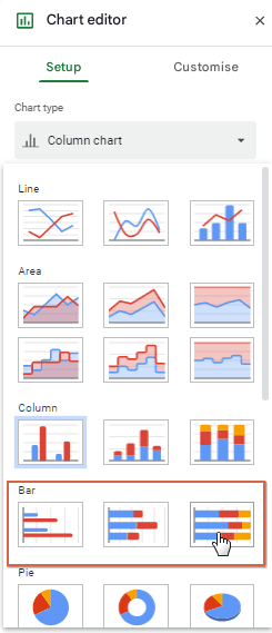
Then select Use row 2 as headers.
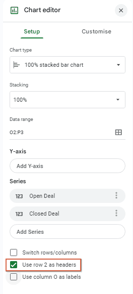
Now your Bar Chart has been created in your Google Sheet.
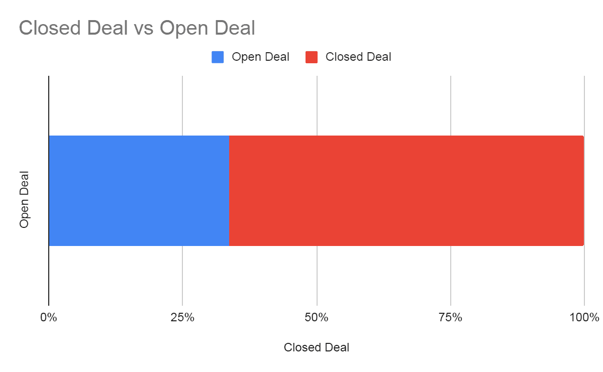
Using the above steps you can also add another type of Bar Graph Chart and Pie Chart. For Example:
Bar Chart:
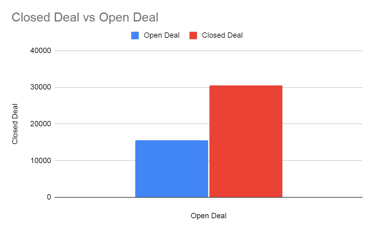
Pie Chart:
Conclusion
Creating a sales pipeline dashboard in Google Sheets is an efficient way to manage your sales process. The sales pipeline template in Google Sheets offers flexibility, real-time collaboration, and powerful features to track your sales activities effectively. By following this ultimate guide, you can set up a comprehensive sales pipeline dashboard that meets your business needs.
Say Goodbye to Tedious Data Exports! 🚀
Are you tired of spending hours manually exporting CSVs from different tools and importing them into Google Sheets?
Superjoin is a data connector for Google Sheets that connects your favorite SaaS tools to Google Sheets automatically. You can get data from these platforms into Google Sheets automatically to build reports that update automatically.
Bid farewell to tedious exports and repetitive tasks. With Superjoin, you can add 1 additional day to your week. Try Superjoin out for free or schedule a demo.
A sales pipeline dashboard is an essential tool for sales teams to manage and track their sales processes effectively. It provides a visual representation of your sales funnel, from lead generation to closing deals. While there are many tools available for creating sales pipeline dashboards, Google Sheets stands out due to its accessibility, flexibility, and powerful features. In this ultimate guide, we will walk you through creating a comprehensive sales pipeline dashboard in Google Sheets.
Why Use Google Sheets for Sales Pipeline?
Google Sheets offers several advantages for managing your sales pipeline:
Accessibility: As a cloud-based tool, Google Sheets is accessible from anywhere, on any device.
Collaboration: Multiple team members can collaborate in real time, making it easier to update and share information.
Customizability: You can tailor your sales pipeline to fit your specific needs with customizable templates and functions.
Integration: Google Sheets can integrate with other tools and platforms, enhancing its functionality. For instance, you can seamlessly connect data from PostgreSQL to Google Sheets to ensure your sales dashboard reflects real-time updates from your database. This integration helps you consolidate and analyze data across various sources efficiently.
Setting Up Your Sales Pipeline Dashboard
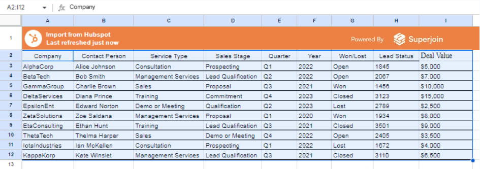
To illustrate how to make a Sales Pipeline Dashboard in Google Sheets, let's work with a sample dataset. The dataset, shown below, is extracted from HubSpot and imported into Google Sheets using Superjoin.
Here are the steps to automate HubSpot with Google Sheets using Superjoin:
Automate HubSpot Data Exports to Google Sheets with Superjoin
HubSpot's default reporting system lacks built-in scheduling for exports. This means manually exporting reports at regular intervals and relying on email reminders for new data. This approach can be inefficient and lead to outdated information.
Superjoin offers a solution to automate HubSpot report exports to Google Sheets. Here's how it works:
Install Superjoin:
Go to your Google Sheets account and access the Extensions menu.
Select "Add-ons" > “Get add ons” to open the Google Workspace Marketplace.
Search for "Superjoin" and install the app.
Connect Superjoin to HubSpot:
Launch Superjoin from the Extensions > Add-ons option>Launch Superjoin.
Choose HubSpot from the list of available Connections.
Click on Connect: Click on Connect and follow the on-screen instructions to connect your HubSpot account to Google Sheets seamlessly.
Choose Data Objects: Select the specific data objects you wish to import from HubSpot, such as Deals data.
Customize Field Selection: Customize your data import by choosing which fields to include and preview your data visually before importing.
Initiate Import: Click on Import, and watch as your HubSpot data populates your Google spreadsheet instantly.
Set up a Schedule: Superjoin lets you refresh your imported data instantly with one click or set it to auto-refresh on a pre-set schedule.
The data will be seamlessly imported into your Google Sheet.
Benefits of Superjoin:
Eliminates manual exports: No more repetitive exporting of reports from HubSpot.
Ensures data accuracy: Always work with the latest information from HubSpot.
Saves time and effort: Automates data transfer and scheduling.
Improves data analysis: Streamlines the process for analyzing HubSpot data in Google Sheets.
Limitations of Superjoin:
Free Plan Limitations: Although Superjoin provides a free plan, it imposes restrictions on the number of connections you can establish. Please review the plan details here.
Superjoin streamlines the HubSpot to Google Sheets data flow, saving you time and ensuring you always have access to the most up-to-date information.
Open Deals and Closed Deals with Values
Step1: Import Dataset into Google Sheets
Open Google Sheets and create a new spreadsheet.
Enter the Data into the spreadsheet with the following columns:
Company
Contact Person
Service Type
Sales Stage
Quarter
Year
Won/Lost
Lead Status
Deal Value
Step 2: Calculations for Open and Closed Deals
Open Deals
Filter Data: Use Google Sheets functions to filter for open deals.
Filter Function: =FILTER(H3:H12, G3:G12 = "Open") (assuming data starts from row 3 to 12).
Sum of Open Deals: Calculate the total value of open deals.
SUMIF Function: =SUMIF(G3:G12, "Open", I3:I12)
Number of Open Deals: Calculate the total no. of open deals.
COUNTIF Function: =COUNTIF( G3:G12, “Open”)
Closed Deals
Filter Data: Use Google Sheets functions to filter for closed deals.
Filter Function: =FILTER(H3:H12, G3:G12 = "Closed")
Sum of Closed Deals: Calculate the total value of closed deals.
SUMIF Function: =SUMIF(G3:G12, "Closed", I3:I12)
Number of Closed Deals: Calculate the total no. of closed deals.
COUNTIF Function: =COUNTIF( G3:G12, “Closed”)
After performing the above steps you will get these tables:
Open Deals by Stage
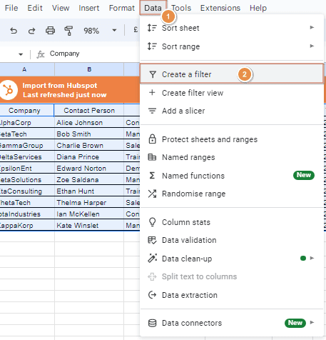
Step 1: Filter for Open Deals
Select Your Data Range: Highlight the range of your data including the headers, for example, A2:I12.
Create a Filter:
Go to the menu and select Data > Create a filter.
A filter icon will appear in each header cell.
Apply the Filter:
Click on the filter icon in the "Won/Lost" header cell (Column G).
Uncheck all options except for "Open" and click OK.
Now your data will only show rows where the "Won/Lost" status is "Open".
Step 2: Summarize Open Deals by Stage
Create a Pivot Table:
Select your data range.
Go to Insert > Pivot table.
Set up the pivot table to summarize the open deals by "Sales Stage".
Configure the Pivot Table:
Rows: Add "Sales Stage".
Values: Add "Deal Value" and set it to SUM.
Filter: Add "Won/Lost" and filter to include only "Open".
Step 3: Organize the Data for Display
Here’s how to organize the data similarly to the example image:
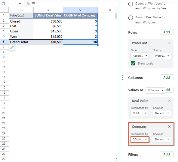
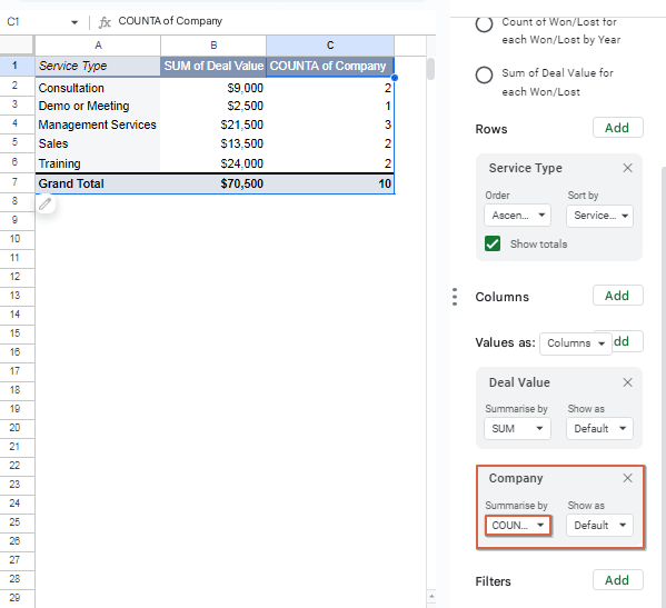
Deals Won and Lost by Segment
Step 1: Create Pivot Tables
Select Your Data Range: Highlight the range of your data including the headers, for example, A2:I12.
Create a Pivot Table:
Go to the menu and select Insert > Pivot table.
A menu will appear, Click on Create.
A new sheet will be created with the pivot table editor.
Set Up the Pivot Table for Deals Lost and Won:
Rows: Add "Won/Lost".
Values: Add "Deal Value" and set it to SUM.
Values: Add "Company" (to count the number of deals) and set it to COUNTA.
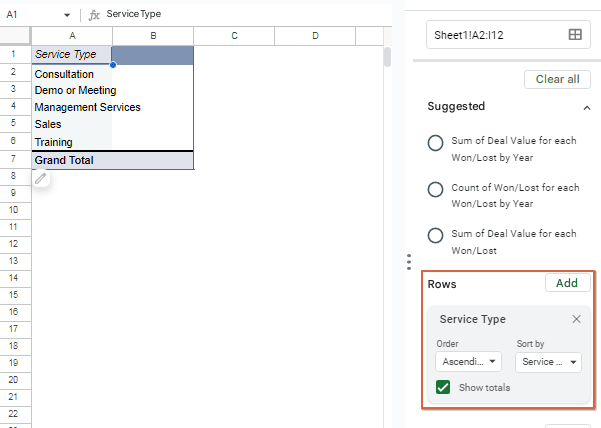
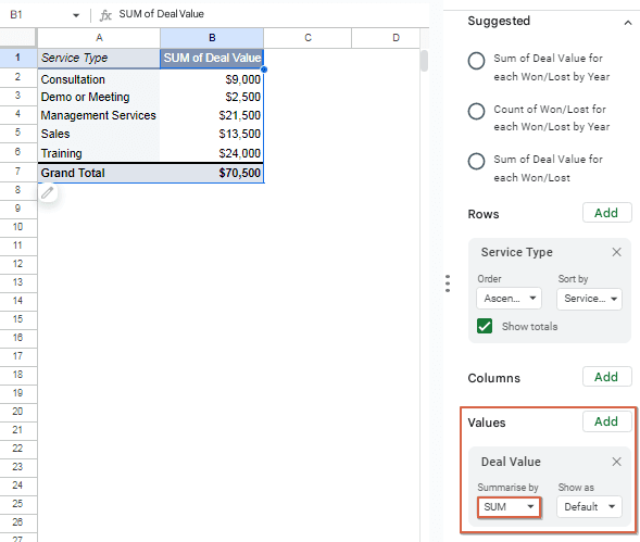
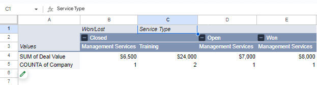
Step 2: Create Another Pivot Table for Service Type
Select Your Data Range:
Highlight the range of your data including the headers.
Create a Pivot Table:
Go to the menu and select Insert > Pivot table.
A new sheet will be created with the pivot table editor.
Set Up the Pivot Table for Service Type:
Rows: Add "Service Type".
Values: Add "Deal Value" and set it to SUM.
Values: Add "Company" (to count the number of deals) and set it to COUNTA.
Step 3: Organize and Format the Data
Combine the Pivot Table Data:
Create a new sheet or section in your existing sheet to combine the summarized data from both pivot tables.
Organize the Data into a Summary Table:
The Power of Graphical Visualization
Data. Data everywhere. In the world of sales, you're constantly bombarded with numbers: targets, quotas, individual rep performance, product breakdowns. It's enough to make your head spin! But what if there was a way to transform this data overload into actionable insights, a way to see your sales success story unfold visually?
Enter the magic of graphical visualization. By turning those numbers into charts, graphs, and dashboards, you can unlock a deeper understanding of your sales performance and make data-driven decisions that propel you forward.
Suggested reads- How to Analyze Sales Rep Performance in Google Sheets
Why Visualize Your Sales?
Imagine trying to decipher a symphony by reading sheet music alone. Now imagine listening to that same symphony – the highs and lows, the crescendos and decrescendos, all come alive. Visualization is to data what music is to sheet music. It brings your sales story to life, revealing trends, patterns, and outliers that might otherwise go unnoticed.
Here's how visualization can benefit your sales team:
Spot Trends: Line charts can expose seasonal fluctuations or track progress towards goals. Identify peaks and valleys to optimize sales strategies throughout the year.
Benchmark Performance: Compare sales figures across different product categories, regions, or sales reps with bar graphs. See who's crushing it and who needs extra support.
Uncover Relationships: Scatter plots can reveal hidden connections between variables. Does marketing spend correlate with sales in a particular region? Visualization can help you answer these questions.
Boost Communication: A well-designed sales dashboard can be a powerful communication tool. Present data to stakeholders in a clear, concise way and secure buy-in for new initiatives.
Charts
The following data visualization presents the success rate of projects, categorized as won or lost.
Bar Charts: Perfect for comparing categories or performance metrics.
Steps to Insert a Bar Chart to your Sheet:
Select desired range of data.
Go to the menu and select Insert > Charts.
Select a Bar Chart from the list.
Then select Use row 2 as headers.
Now your Bar Chart has been created in your Google Sheet.
Using the above steps you can also add another type of Bar Graph Chart and Pie Chart. For Example:
Bar Chart:
Pie Chart:
Conclusion
Creating a sales pipeline dashboard in Google Sheets is an efficient way to manage your sales process. The sales pipeline template in Google Sheets offers flexibility, real-time collaboration, and powerful features to track your sales activities effectively. By following this ultimate guide, you can set up a comprehensive sales pipeline dashboard that meets your business needs.
Say Goodbye to Tedious Data Exports! 🚀
Are you tired of spending hours manually exporting CSVs from different tools and importing them into Google Sheets?
Superjoin is a data connector for Google Sheets that connects your favorite SaaS tools to Google Sheets automatically. You can get data from these platforms into Google Sheets automatically to build reports that update automatically.
Bid farewell to tedious exports and repetitive tasks. With Superjoin, you can add 1 additional day to your week. Try Superjoin out for free or schedule a demo.
FAQs
How can I automate my sales pipeline in Google Sheets?
How can I automate my sales pipeline in Google Sheets?
How often should I update my sales pipeline dashboard?
How often should I update my sales pipeline dashboard?
Can I customize my sales pipeline dashboard to fit my specific needs?
Can I customize my sales pipeline dashboard to fit my specific needs?
Automatic Data Pulls
Visual Data Preview
Set Alerts
other related blogs

Try it now