Microsoft Excel Tutorial
Add a Line of Best Fit in Excel
Learn how to put a line of best fit in Excel with easy to follow steps. Ideal for business people who want to analyse patterns and base their decisions.
Table of Contents
The capacity to recognize trends is essential for making informed decisions in Excel, which is why data visualization is so crucial. The most effective way to do this is to learn how to include a line of best fit in your charts or scatter plots. Understanding how to appropriately use and assess a line of best fit will be quite beneficial, regardless of whether you are analyzing sales data, performance tracking, or future trend projection. This article will show you how to add a line of best fit in Excel and provide advice on how to keep it accurate.
What is the Line of Best Fit?
On a scatter chart, the line of best fit, or trend line, is a straight line that represents the data. It minimizes the distance of each data point from itself, making it an excellent tool for estimating future values based on past performance. For more advanced customization of your charts, you can explore creating custom reports in Excel to better visualize and analyze your data.
How to Add a Line of Best Fit in Excel
There are several ways to add a line of best fit in Excel. Below are the most common methods:
Built-in Chart Tools
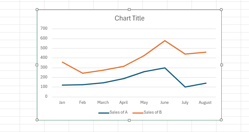
Create a Chart: First, select your data range. Then, navigate to "Insert" > "Chart". This will create a default chart based on your data. If you're working with large datasets, consider connecting an external data source to keep your data up-to-date.
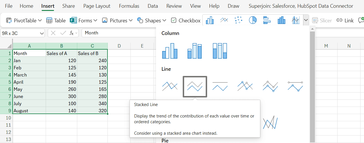
This will create a default chart based on your data.
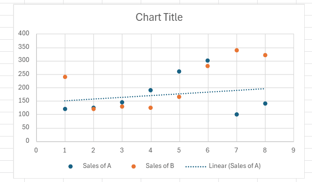
Right-click on any of the blue dots within the chart to choose a data point. Regardless of the blue dot you select, Excel automatically selects all of your data points and typically populates the appropriate menu. When you right-click on this data point, you see a context menu. From this menu, select the option for "Add Trendline." This displays a "Format Trendline" panel on the right side of the spreadsheet.
Tips for Ensuring Accuracy
Data Range: Ensure your data range is correct. The accuracy of the line of best fit depends on the quality and completeness of your data.
Outliers: Be mindful of outliers that can skew the trendline. Consider removing or accounting for outliers before adding a trendline. For detailed guidance on handling data issues, check out our guide on common challenges in Excel.
Equation Interpretation: If you display the equation on the chart, double-check that it matches the expected trend. This is crucial if you're using the line of best fit for predictions.
Conclusion
Knowing how to add a line of best fit in Excel is essential for anyone working with data. Gaining proficiency in this area will improve your ability to analyze data, whether you need precise forecasting calculations or a fast visual representation of data trends. Investigate various approaches to see which suits your demands the most, and don't be afraid to modify the trendline for increased precision. Keep in mind that Excel provides a versatile platform for all of your data analysis needs, including linking many data sources and building bespoke dashboards.
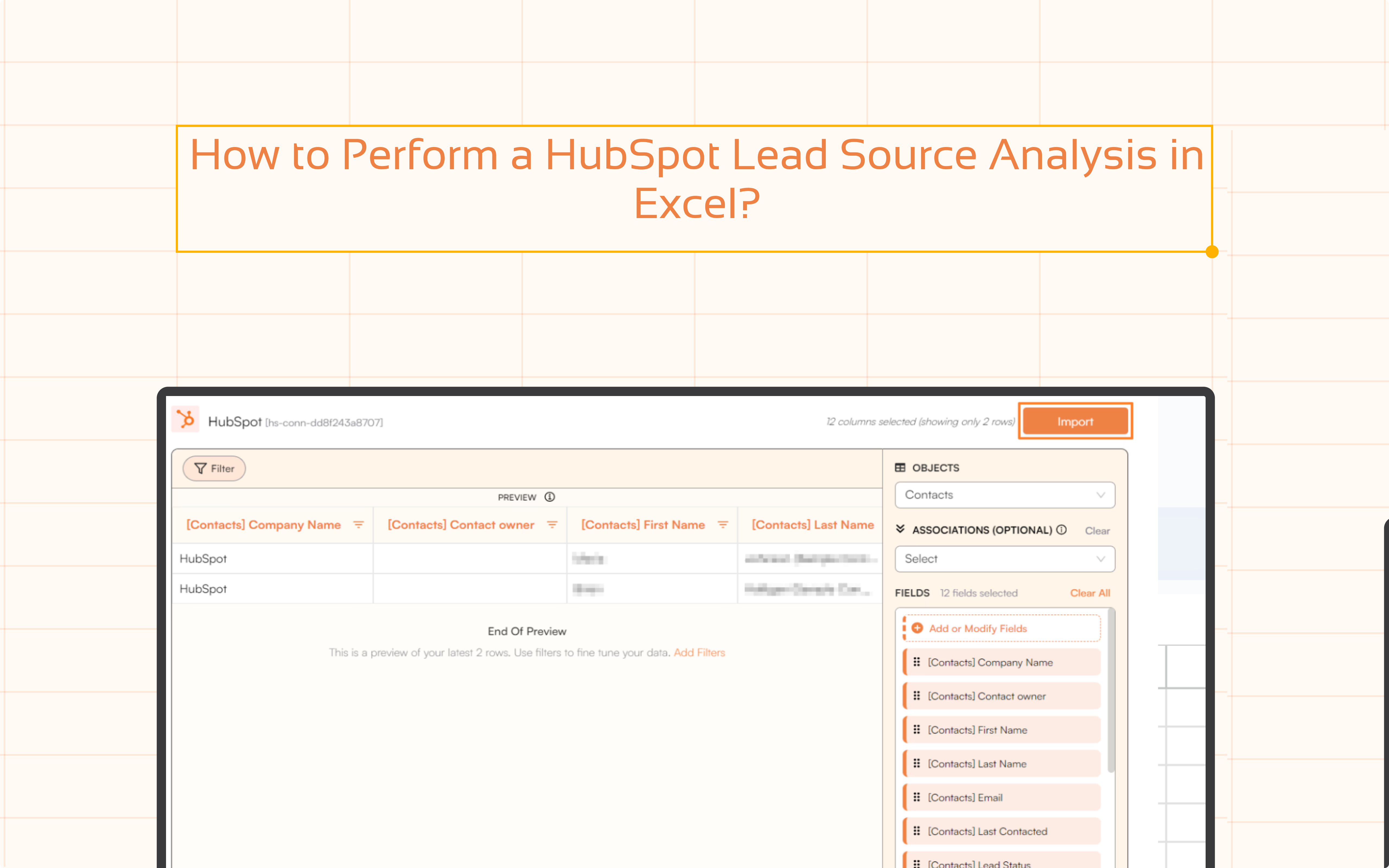
Say Goodbye to Tedious Data Exports! 🚀
Are you tired of spending hours manually exporting CSVs from different tools and importing them into Excel?
Superjoin is a data connector for Excel & Google Sheets that connects your favorite SaaS tools to Excel automatically. You can get data from these platforms into Excel automatically to build reports that update automatically.
Bid farewell to tedious exports and repetitive tasks. With Superjoin, you can add 1 additional day to your week. Try Superjoin for free or schedule a demo.
The capacity to recognize trends is essential for making informed decisions in Excel, which is why data visualization is so crucial. The most effective way to do this is to learn how to include a line of best fit in your charts or scatter plots. Understanding how to appropriately use and assess a line of best fit will be quite beneficial, regardless of whether you are analyzing sales data, performance tracking, or future trend projection. This article will show you how to add a line of best fit in Excel and provide advice on how to keep it accurate.
What is the Line of Best Fit?
On a scatter chart, the line of best fit, or trend line, is a straight line that represents the data. It minimizes the distance of each data point from itself, making it an excellent tool for estimating future values based on past performance. For more advanced customization of your charts, you can explore creating custom reports in Excel to better visualize and analyze your data.
How to Add a Line of Best Fit in Excel
There are several ways to add a line of best fit in Excel. Below are the most common methods:
Built-in Chart Tools
Create a Chart: First, select your data range. Then, navigate to "Insert" > "Chart". This will create a default chart based on your data. If you're working with large datasets, consider connecting an external data source to keep your data up-to-date.
This will create a default chart based on your data.
Right-click on any of the blue dots within the chart to choose a data point. Regardless of the blue dot you select, Excel automatically selects all of your data points and typically populates the appropriate menu. When you right-click on this data point, you see a context menu. From this menu, select the option for "Add Trendline." This displays a "Format Trendline" panel on the right side of the spreadsheet.
Tips for Ensuring Accuracy
Data Range: Ensure your data range is correct. The accuracy of the line of best fit depends on the quality and completeness of your data.
Outliers: Be mindful of outliers that can skew the trendline. Consider removing or accounting for outliers before adding a trendline. For detailed guidance on handling data issues, check out our guide on common challenges in Excel.
Equation Interpretation: If you display the equation on the chart, double-check that it matches the expected trend. This is crucial if you're using the line of best fit for predictions.
Conclusion
Knowing how to add a line of best fit in Excel is essential for anyone working with data. Gaining proficiency in this area will improve your ability to analyze data, whether you need precise forecasting calculations or a fast visual representation of data trends. Investigate various approaches to see which suits your demands the most, and don't be afraid to modify the trendline for increased precision. Keep in mind that Excel provides a versatile platform for all of your data analysis needs, including linking many data sources and building bespoke dashboards.
Say Goodbye to Tedious Data Exports! 🚀
Are you tired of spending hours manually exporting CSVs from different tools and importing them into Excel?
Superjoin is a data connector for Excel & Google Sheets that connects your favorite SaaS tools to Excel automatically. You can get data from these platforms into Excel automatically to build reports that update automatically.
Bid farewell to tedious exports and repetitive tasks. With Superjoin, you can add 1 additional day to your week. Try Superjoin for free or schedule a demo.
FAQs
What types of trendlines can I create in Excel?
What types of trendlines can I create in Excel?
How do I interpret the slope of the trendline?
How do I interpret the slope of the trendline?
Can I add multiple trendlines to a single chart?
Can I add multiple trendlines to a single chart?
Automatic Data Pulls
Visual Data Preview
Set Alerts
other related blogs
Try it now