Microsoft Excel Tutorial
How to Build a Sales Rep Scorecard in Excel?
This thorough guide will help you create a personalized salesperson scorecard in Excel that produces outcomes
Table of Contents
Giving your sales team the resources they need to succeed is essential. An effective tool for monitoring performance, determining strengths and shortcomings, and encouraging a healthy spirit of competition is an Excel sales representative scorecard.
This thorough guide will help you create a personalized salesperson scorecard that produces outcomes.
What is a Predictive Scorecard?
A predictive scorecard, sometimes referred to as a predictive analytics scorecard, is a sophisticated business intelligence and analytics tool that forecasts future results by utilizing predictive models, previous data, and patterns. Predictive scorecards go one step further than typical scorecards, which mainly measure previous performance and current status. They do this by analyzing data to forecast future trends, behaviors, and results.
A predictive scorecard's main objective is to give businesses actionable insights and foresight into possible outcomes so they may proactively take advantage of opportunities, reduce risks, and make well-informed decisions.
Predictive scorecards can reveal hidden patterns and correlations in large datasets by utilizing predictive analytics techniques like machine learning, statistical modeling, and data mining. This allows organizations to more accurately and confidently predict customer behavior, market trends, and business performance.
Creating a Sales Representative Scorecard in Excel Using Hubspot Data
Building a sales rep scorecard in Excel using HubSpot data involves several steps, including extracting relevant data from HubSpot, organizing it in Excel, defining key metrics and calculations, and visualizing the results. If you're using HubSpot or any other CRM, the ability to integrate data directly into Excel through an API can make the entire process seamless. APIs allow you to pull real-time data from HubSpot (or other platforms) into Excel automatically, ensuring that your scorecards always reflect the most up-to-date performance metrics. Or use Superjoin to pull in data from Hubspot to Microsoft Excel.
Here's a step-by-step guide to help you create a comprehensive sales rep scorecard:
1. Data Preparation in Hubspot
Identify Relevant Data:
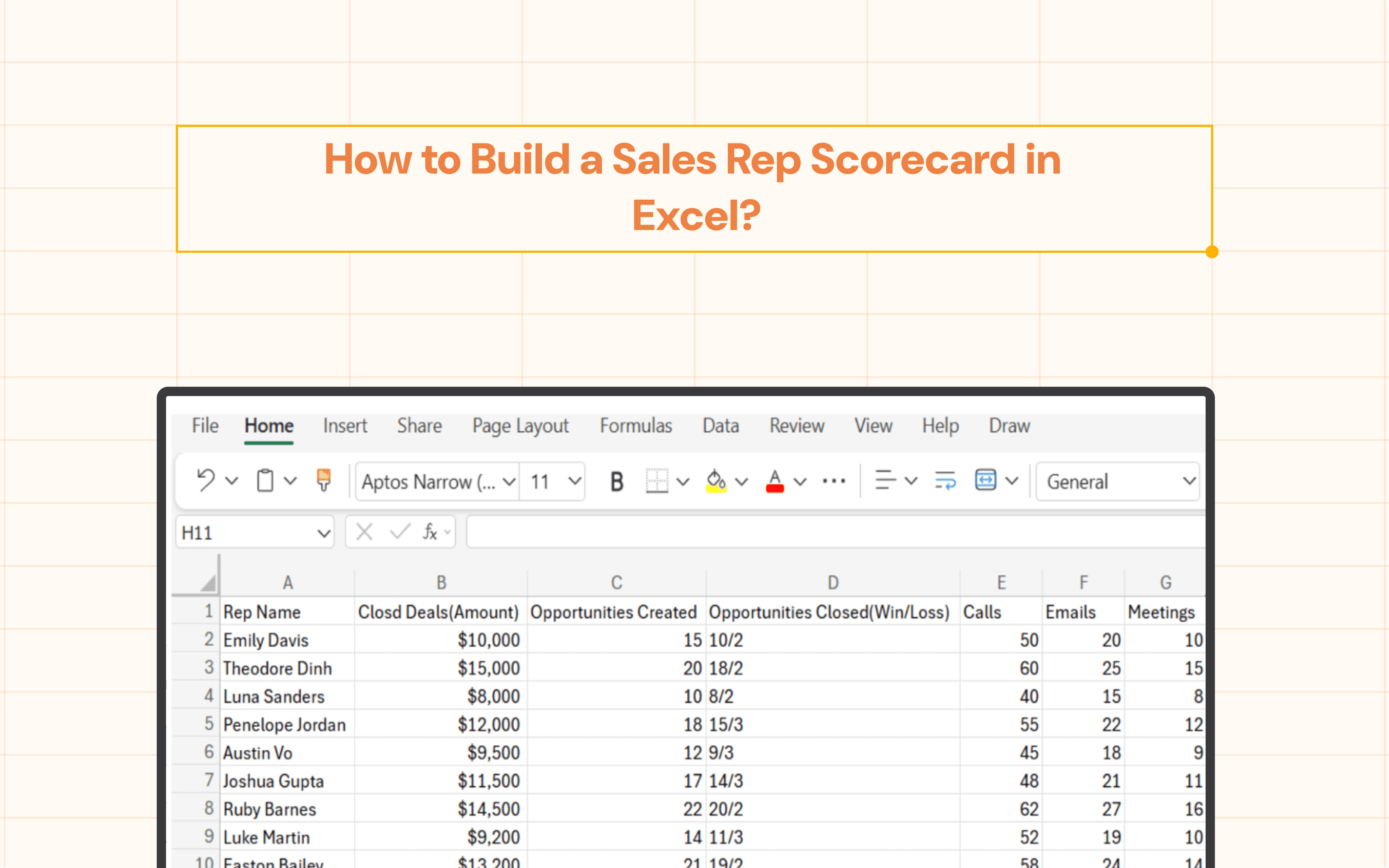
Log in to HubSpot and determine the data points crucial for your sales rep scorecard. Common choices include:
Sales rep names
Closed deals (amount and date)
Opportunities created and closed (win/loss)
Activities (calls, emails, meetings)
Customer satisfaction scores
Export the Data:
Once you've identified the data points, export them from Hubspot. You can achieve this easily using Superjoin. The dataset provided below has been extracted from Hubspot into Excel.
To connect Hubspot data into Microsoft Excel using Superjoin, check out our guide.
2. Setting Up Your Excel Sheet

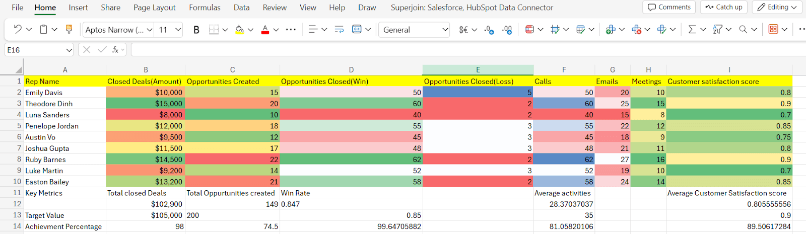
Our dataset comprises several rows, each representing a sales representative and their corresponding performance metrics. These metrics include Closed Deals (Amount), Opportunities Created, Opportunities Closed (Win/Loss), Activities (Calls, Emails, Meetings), and Customer Satisfaction Scores.
3. Calculate Key Metrics
For each sales rep, calculate key metrics such as:
Total Opportunities Created: Sum of the Opportunities Created column.
Win Rate: Number of Opportunities Closed with "Win" status divided by Total Opportunities Closed.
Average Activities: Average of the Activities (Calls, Emails, Meetings) column.
Average Customer Satisfaction Score: Average of the Customer Satisfaction Scores.
You can add more metrics based on your specific requirements.
Step 1: Go to the bottom cell beneath the Closed Deals column, i.e., B12.
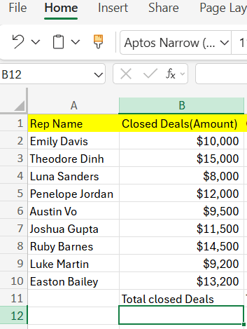
Step 2: Type the formula:
=SUM(B2:B10)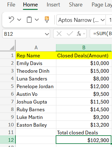
Step 3: The result will appear in cell B12.
Total Opportunities Created:
Step 1: Go to the bottom cell beneath the Opportunities Created column, i.e., C12.
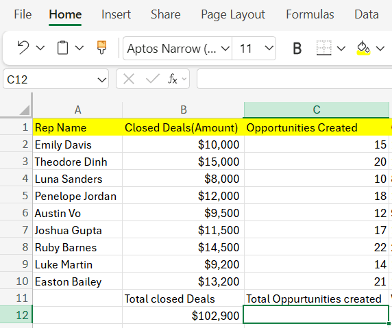
Step 2: Type the formula:
=SUM(C2:C10)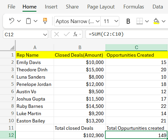
Step 3: The result will appear in cell C12.
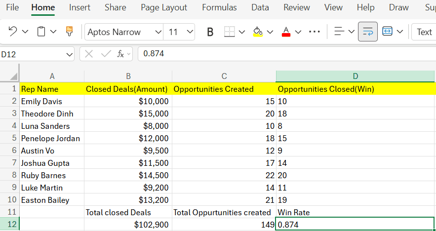
Win Rate:
Step 1: Go to the bottom cell beneath the Win/Loss column, i.e., D12:E12.
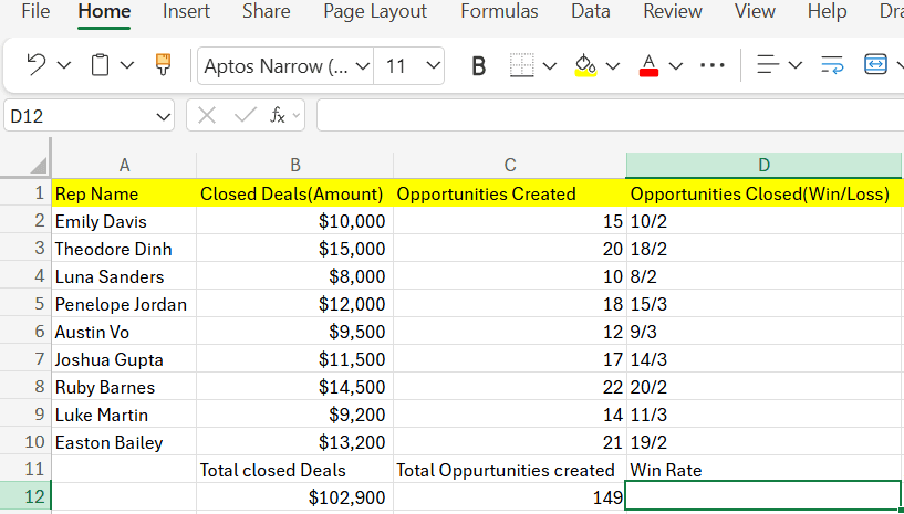
Step 2: Type the formula:
=SUM(D2:D10)/ (SUM(D2:D10) + SUM(E2:E100))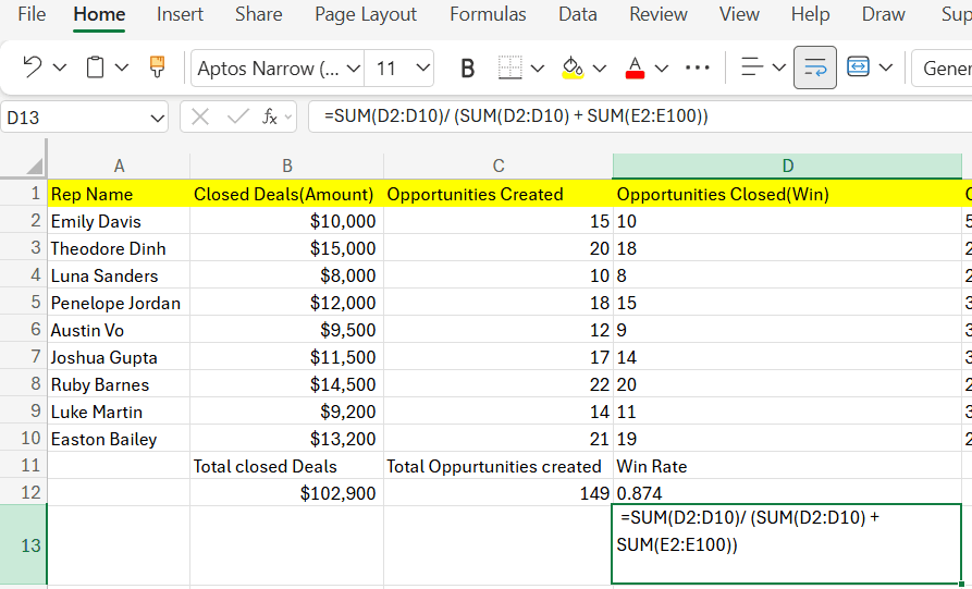
Step 3: The result will appear in cell range D124:E12.
Average Activities:
Step 1: Go to the bottom cell beneath the Activities column, i.e., F12:H12
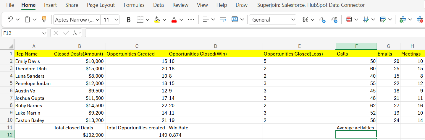
Step 2: Type the formula:
=AVERAGE(F2:H10)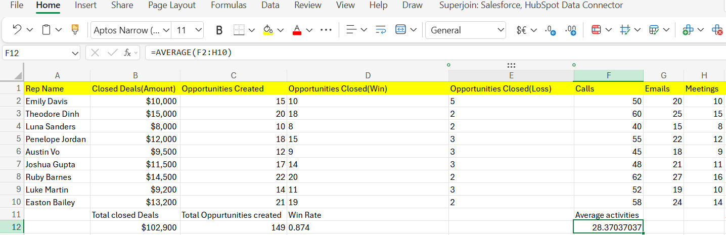
Step 3: The result will appear in cell range F12:H12.
Average Customer Satisfaction Score:
Step 1: Go to the bottom cell beneath the Customer Satisfaction Scores column, i.e., I10.
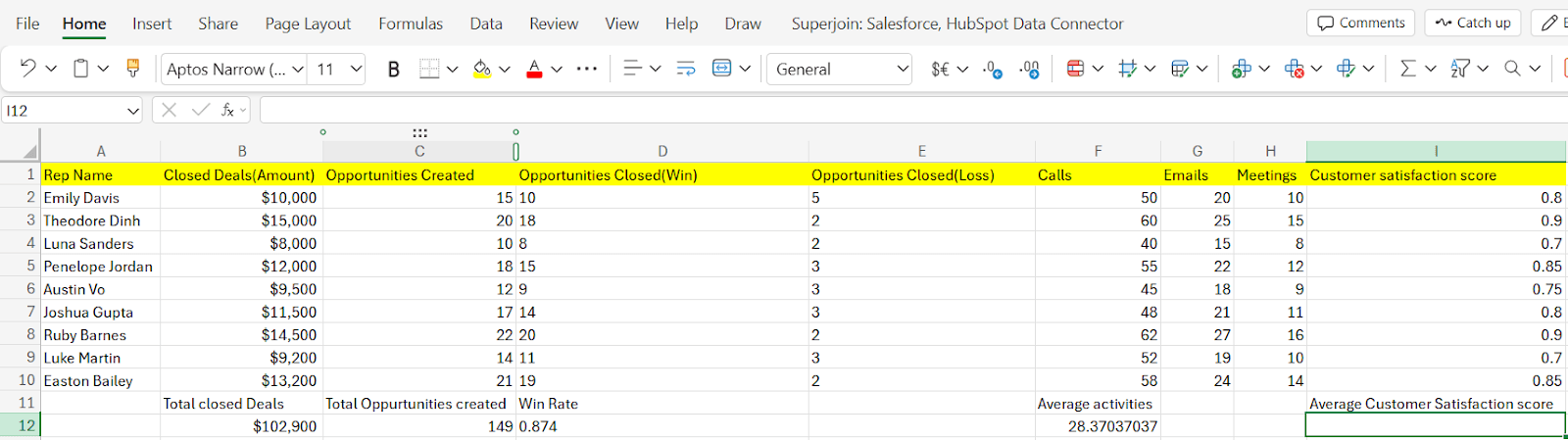
Step 2: Type the formula:
=AVERAGE(I2:I10)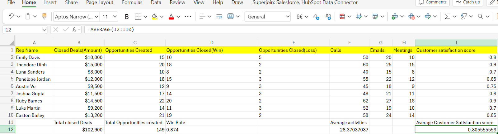
Step 3: The result will appear in cell I12.
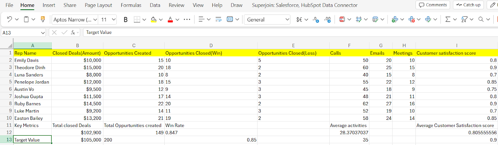
4. Insert Target Values Columns
Step 1: Label the cell below the “Key Metrics” as “Target Values”. In our case, it is cell A25.
Step 2: Determine target values for each metric based on historical performance, industry benchmarks, or organizational goals.
Step 3: Enter these target values in the respective column for each metric. For example, if you have a column for "Total Closed Deals", you would enter the target number of closed deals for each sales rep.
In our case, we went with some modest values as you can see.
5. Calculate Achievement Percentage
Step 1: After entering the target values, use formulas to calculate the achievement percentage for each metric, comparing the Actual Performance to the Target Values.
You can use formulas similar to: =(Actual Performance / Target Value) * 100.
In our case, the Achievement Percentage for Total Closed Deals:
=(B12/B13)*100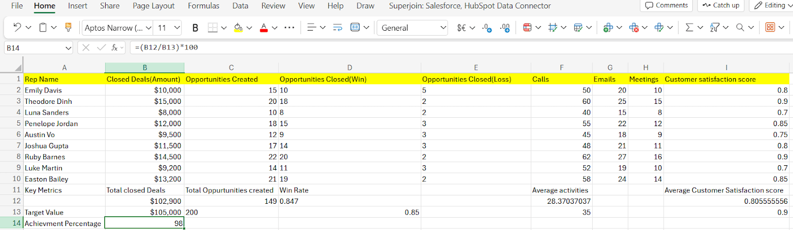
Pro tip: Drag horizontally to calculate the same for all other metrics. In cases where you have merged cells, consider writing a formula with cell range; otherwise, you may encounter errors. Here’s an example,
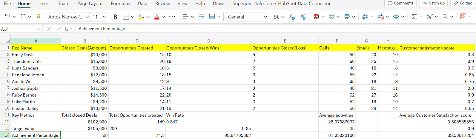
After calculating all the Achievement percentages, the table should look like this.
6. Apply Conditional Formatting
Enhance the scorecard's visual appeal and readability by applying conditional formatting.
To apply conditional formatting to the dataset in Excel, you can follow these steps:
Select the range: Click and drag to select the range of cells where you want to apply conditional formatting. For example, you might want to apply conditional formatting to the columns representing each metric.
Pro tip: Please format each metric separately.
Open the Conditional Formatting Menu: Go to the menu bar and click on "Format" > "Conditional formatting."
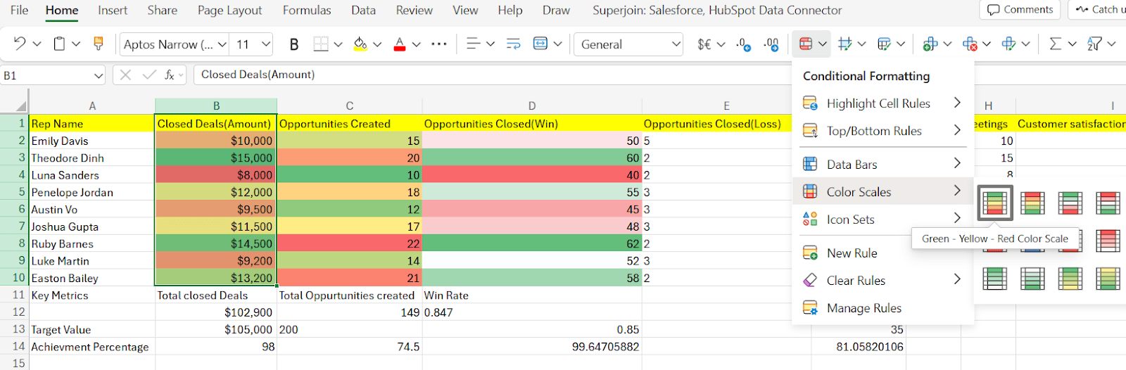
Choose the Formatting Rules: In the Conditional format rules pane on the right, choose the type of conditional formatting you want to apply. For instance, you have the option to select either "Single color" or "Color scale" based on your preference. In our case for the “Closed Deals” column, we will use the “Color scale”.
Apply the Formatting: Click on the "Done" button to apply the conditional formatting to the selected range of cells.
Step 5: Repeat the same for other metrics, but make sure to not choose a similar color for consecutive columns. This would help in distinguishing top values in a column.
Review and Adjust: Review the applied formatting to ensure it reflects the intended conditions and formatting styles. If necessary, make adjustments to the formatting rules or range selection.
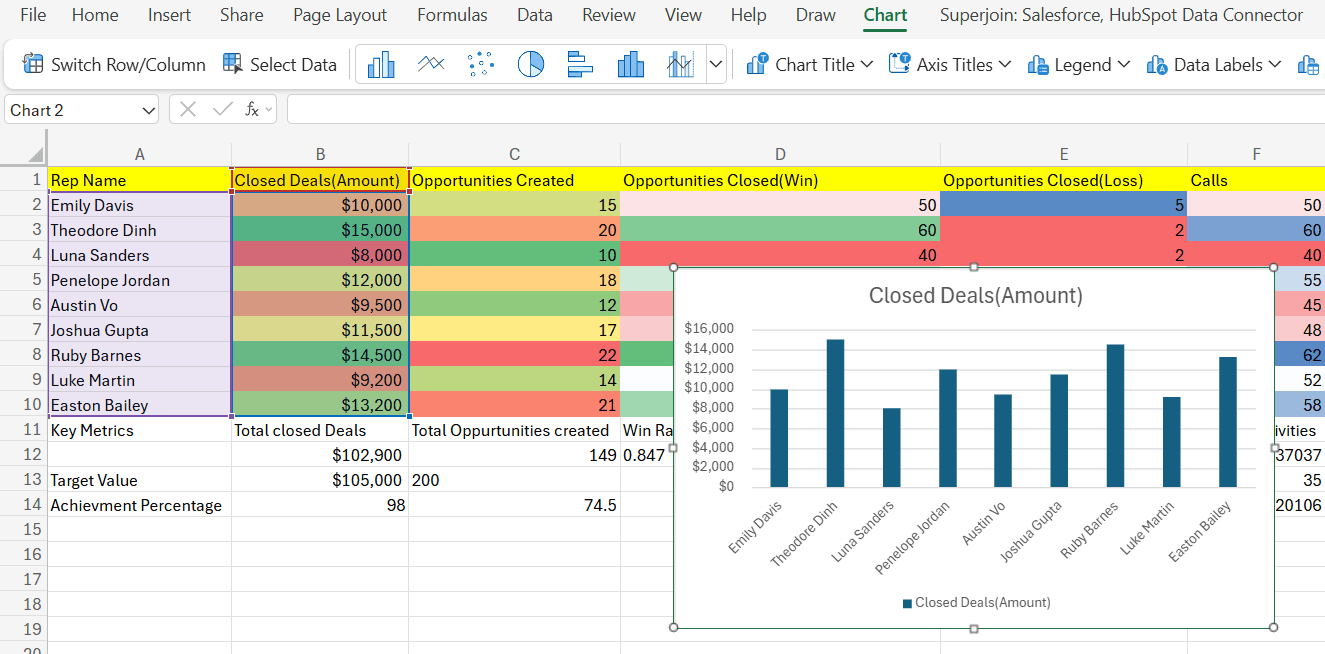
7. Creating a Column Chart to Compare Total Closed Deals for Each Sales Rep
Select Data Range: Click and drag to select the range of data you want to include in the chart. For this example, select the range of cells containing the Rep Names and their corresponding Total Closed Deals.
Insert the Chart: Go to the menu bar and click on "Insert" > "Chart."
8. Creating a Stacked Column Chart for Win/Loss Metric
Select Data Range: Highlight the data range, including the sales reps' names and the corresponding Win and Loss counts.
Insert the Chart: Go to the menu bar and click on "Insert" > "Chart."
Choose Chart Type: In the Chart editor, select "Chart types" (the icon that looks like a column chart). Choose “Stacked Column Chart” from the options.
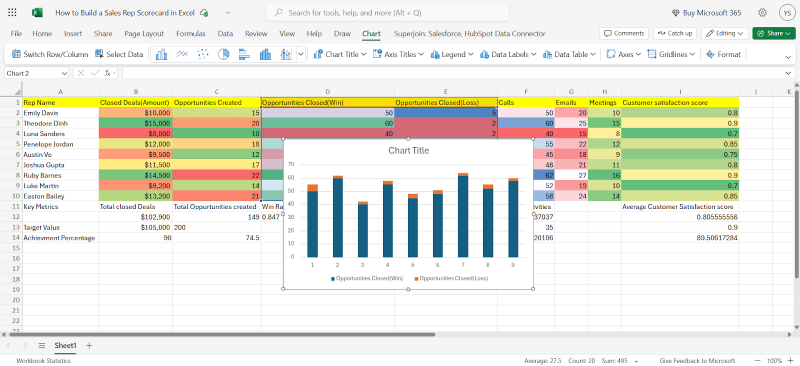
Follow the similar steps to create a column chart for activities (Calls, Emails, Meetings) vs Reps.
Conclusion
Sales managers may easily spot trends, acknowledge accomplishments, and address areas for improvement thanks to the scorecard's insightful information on important indicators. Additionally, companies may foster a sense of accountability and ownership that propels both individual and group achievement by integrating sales representatives in the target-setting process and offering continual support and development opportunities.
An effective Excel sales representative scorecard is a tool, not a strict system. As your company develops, periodically examine and improve your KPIs and scorecard. You may enable your team to continuously surpass expectations and advance your company by concentrating on the appropriate measurements, setting clear goals and feedback, and cultivating a culture of continuous development.
Say Goodbye To Tedious Data Exports! 🚀
Are you tired of spending hours manually exporting CSVs from different tools and importing them into Excel?
Superjoin is a data connector for Excel & Google Sheets that connects your favorite SaaS tools to Excel automatically. You can get data from these platforms into Excel automatically to build reports that update automatically.
Bid farewell to tedious exports and repetitive tasks. With Superjoin, you can add 1 additional day to your week. Try Superjoin for free or schedule a demo.
Giving your sales team the resources they need to succeed is essential. An effective tool for monitoring performance, determining strengths and shortcomings, and encouraging a healthy spirit of competition is an Excel sales representative scorecard.
This thorough guide will help you create a personalized salesperson scorecard that produces outcomes.
What is a Predictive Scorecard?
A predictive scorecard, sometimes referred to as a predictive analytics scorecard, is a sophisticated business intelligence and analytics tool that forecasts future results by utilizing predictive models, previous data, and patterns. Predictive scorecards go one step further than typical scorecards, which mainly measure previous performance and current status. They do this by analyzing data to forecast future trends, behaviors, and results.
A predictive scorecard's main objective is to give businesses actionable insights and foresight into possible outcomes so they may proactively take advantage of opportunities, reduce risks, and make well-informed decisions.
Predictive scorecards can reveal hidden patterns and correlations in large datasets by utilizing predictive analytics techniques like machine learning, statistical modeling, and data mining. This allows organizations to more accurately and confidently predict customer behavior, market trends, and business performance.
Creating a Sales Representative Scorecard in Excel Using Hubspot Data
Building a sales rep scorecard in Excel using HubSpot data involves several steps, including extracting relevant data from HubSpot, organizing it in Excel, defining key metrics and calculations, and visualizing the results. If you're using HubSpot or any other CRM, the ability to integrate data directly into Excel through an API can make the entire process seamless. APIs allow you to pull real-time data from HubSpot (or other platforms) into Excel automatically, ensuring that your scorecards always reflect the most up-to-date performance metrics. Or use Superjoin to pull in data from Hubspot to Microsoft Excel.
Here's a step-by-step guide to help you create a comprehensive sales rep scorecard:
1. Data Preparation in Hubspot
Identify Relevant Data:
Log in to HubSpot and determine the data points crucial for your sales rep scorecard. Common choices include:
Sales rep names
Closed deals (amount and date)
Opportunities created and closed (win/loss)
Activities (calls, emails, meetings)
Customer satisfaction scores
Export the Data:
Once you've identified the data points, export them from Hubspot. You can achieve this easily using Superjoin. The dataset provided below has been extracted from Hubspot into Excel.
To connect Hubspot data into Microsoft Excel using Superjoin, check out our guide.
2. Setting Up Your Excel Sheet
Our dataset comprises several rows, each representing a sales representative and their corresponding performance metrics. These metrics include Closed Deals (Amount), Opportunities Created, Opportunities Closed (Win/Loss), Activities (Calls, Emails, Meetings), and Customer Satisfaction Scores.
3. Calculate Key Metrics
For each sales rep, calculate key metrics such as:
Total Opportunities Created: Sum of the Opportunities Created column.
Win Rate: Number of Opportunities Closed with "Win" status divided by Total Opportunities Closed.
Average Activities: Average of the Activities (Calls, Emails, Meetings) column.
Average Customer Satisfaction Score: Average of the Customer Satisfaction Scores.
You can add more metrics based on your specific requirements.
Step 1: Go to the bottom cell beneath the Closed Deals column, i.e., B12.
Step 2: Type the formula:
=SUM(B2:B10)Step 3: The result will appear in cell B12.
Total Opportunities Created:
Step 1: Go to the bottom cell beneath the Opportunities Created column, i.e., C12.
Step 2: Type the formula:
=SUM(C2:C10)Step 3: The result will appear in cell C12.
Win Rate:
Step 1: Go to the bottom cell beneath the Win/Loss column, i.e., D12:E12.
Step 2: Type the formula:
=SUM(D2:D10)/ (SUM(D2:D10) + SUM(E2:E100))Step 3: The result will appear in cell range D124:E12.
Average Activities:
Step 1: Go to the bottom cell beneath the Activities column, i.e., F12:H12
Step 2: Type the formula:
=AVERAGE(F2:H10)Step 3: The result will appear in cell range F12:H12.
Average Customer Satisfaction Score:
Step 1: Go to the bottom cell beneath the Customer Satisfaction Scores column, i.e., I10.
Step 2: Type the formula:
=AVERAGE(I2:I10)Step 3: The result will appear in cell I12.
4. Insert Target Values Columns
Step 1: Label the cell below the “Key Metrics” as “Target Values”. In our case, it is cell A25.
Step 2: Determine target values for each metric based on historical performance, industry benchmarks, or organizational goals.
Step 3: Enter these target values in the respective column for each metric. For example, if you have a column for "Total Closed Deals", you would enter the target number of closed deals for each sales rep.
In our case, we went with some modest values as you can see.
5. Calculate Achievement Percentage
Step 1: After entering the target values, use formulas to calculate the achievement percentage for each metric, comparing the Actual Performance to the Target Values.
You can use formulas similar to: =(Actual Performance / Target Value) * 100.
In our case, the Achievement Percentage for Total Closed Deals:
=(B12/B13)*100Pro tip: Drag horizontally to calculate the same for all other metrics. In cases where you have merged cells, consider writing a formula with cell range; otherwise, you may encounter errors. Here’s an example,
After calculating all the Achievement percentages, the table should look like this.
6. Apply Conditional Formatting
Enhance the scorecard's visual appeal and readability by applying conditional formatting.
To apply conditional formatting to the dataset in Excel, you can follow these steps:
Select the range: Click and drag to select the range of cells where you want to apply conditional formatting. For example, you might want to apply conditional formatting to the columns representing each metric.
Pro tip: Please format each metric separately.
Open the Conditional Formatting Menu: Go to the menu bar and click on "Format" > "Conditional formatting."
Choose the Formatting Rules: In the Conditional format rules pane on the right, choose the type of conditional formatting you want to apply. For instance, you have the option to select either "Single color" or "Color scale" based on your preference. In our case for the “Closed Deals” column, we will use the “Color scale”.
Apply the Formatting: Click on the "Done" button to apply the conditional formatting to the selected range of cells.
Step 5: Repeat the same for other metrics, but make sure to not choose a similar color for consecutive columns. This would help in distinguishing top values in a column.
Review and Adjust: Review the applied formatting to ensure it reflects the intended conditions and formatting styles. If necessary, make adjustments to the formatting rules or range selection.
7. Creating a Column Chart to Compare Total Closed Deals for Each Sales Rep
Select Data Range: Click and drag to select the range of data you want to include in the chart. For this example, select the range of cells containing the Rep Names and their corresponding Total Closed Deals.
Insert the Chart: Go to the menu bar and click on "Insert" > "Chart."
8. Creating a Stacked Column Chart for Win/Loss Metric
Select Data Range: Highlight the data range, including the sales reps' names and the corresponding Win and Loss counts.
Insert the Chart: Go to the menu bar and click on "Insert" > "Chart."
Choose Chart Type: In the Chart editor, select "Chart types" (the icon that looks like a column chart). Choose “Stacked Column Chart” from the options.
Follow the similar steps to create a column chart for activities (Calls, Emails, Meetings) vs Reps.
Conclusion
Sales managers may easily spot trends, acknowledge accomplishments, and address areas for improvement thanks to the scorecard's insightful information on important indicators. Additionally, companies may foster a sense of accountability and ownership that propels both individual and group achievement by integrating sales representatives in the target-setting process and offering continual support and development opportunities.
An effective Excel sales representative scorecard is a tool, not a strict system. As your company develops, periodically examine and improve your KPIs and scorecard. You may enable your team to continuously surpass expectations and advance your company by concentrating on the appropriate measurements, setting clear goals and feedback, and cultivating a culture of continuous development.
Say Goodbye To Tedious Data Exports! 🚀
Are you tired of spending hours manually exporting CSVs from different tools and importing them into Excel?
Superjoin is a data connector for Excel & Google Sheets that connects your favorite SaaS tools to Excel automatically. You can get data from these platforms into Excel automatically to build reports that update automatically.
Bid farewell to tedious exports and repetitive tasks. With Superjoin, you can add 1 additional day to your week. Try Superjoin for free or schedule a demo.
FAQs
How can I ensure data accuracy and consistency between Hubspot and Excel?
How can I ensure data accuracy and consistency between Hubspot and Excel?
How often should I update the metrics and targets on the sales rep scorecard?
How often should I update the metrics and targets on the sales rep scorecard?
Is it recommended to use generic incentive strategies instead of tying incentives to sales rep scorecard performance?
Is it recommended to use generic incentive strategies instead of tying incentives to sales rep scorecard performance?
Automatic Data Pulls
Visual Data Preview
Set Alerts
other related blogs

Try it now