Microsoft Excel Tutorial
How to Create a Scatter Plot in Microsoft Excel
Learn how to make a scatter plot in Microsoft Excel. Ideal for everyone from students collecting data to post grad and working professionals.
Table of Contents
Excel is a dependable and efficient program that lets users make a variety of charts and graphs for assessments. Scatter plots are best suited for illustrating the relationship between two sets of data. Simply said, while examining data, the ability to create a scatter plot chart is essential for researchers, students, and other professionals. A detailed method for creating scatter plots is given in this article.
Introduction to Scatter Plots
The values of two variables for a collection of data are represented graphically by a scatter plot, also known as a scattergram or scatter chart. The data is displayed as a collection of points, with the ordinate representing the value of one variable and the abscissa representing the value of the other. This makes it possible to spot patterns, correlations, and irregularities in the data, leading to a complete understanding.
Scatter plots can be extremely useful in corporate settings for connection analysis, such as comparing consumer interaction with product purchases, in addition to their application in academia and research.
For example, companies can easily import customer data from Intercom and use it to create a scatter plot against important KPIs like response times or satisfaction ratings by connecting Intercom to Excel. Teams can make better decisions about customer service or sales tactics by using this visual representation to swiftly see trends.
Step-by-Step Guide on How to Make a Scatter Plot in Excel
Input Your Data
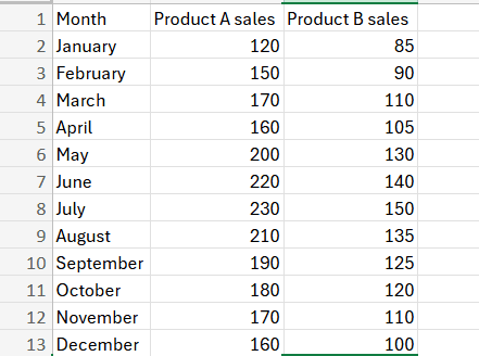
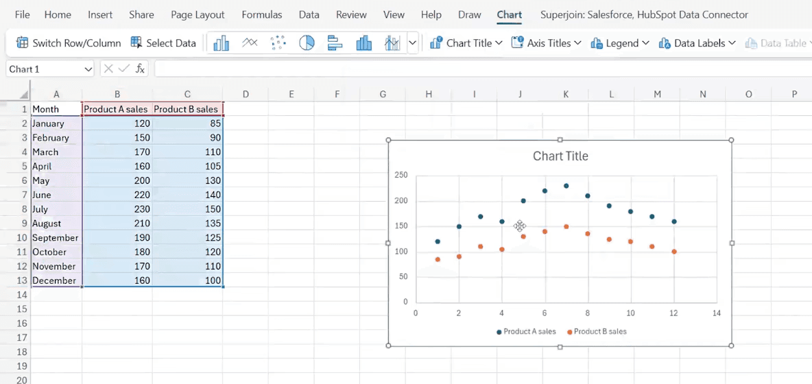
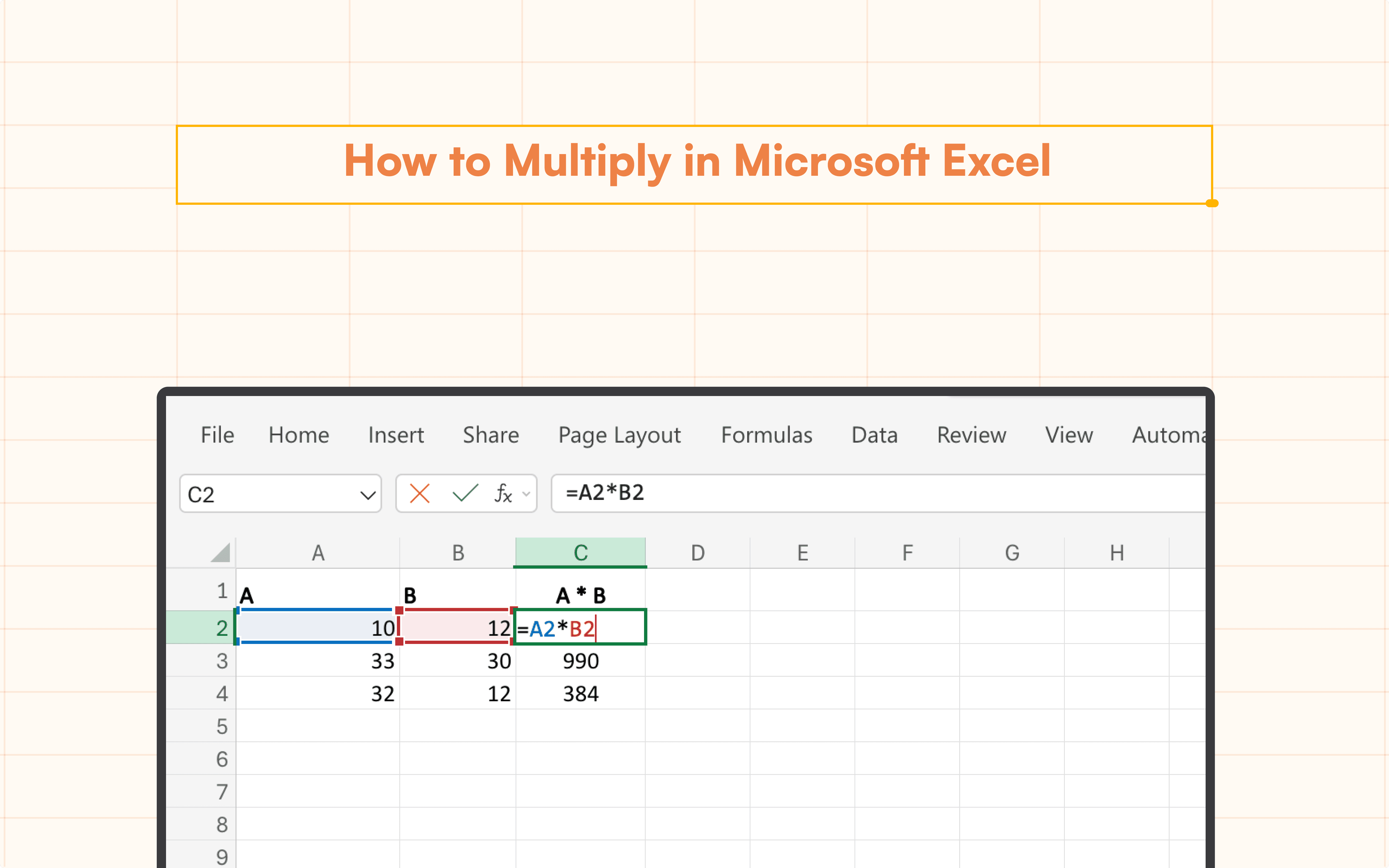
As seen below, enter the data into an Excel sheet. The months should be listed in the first column, followed by Product A sales in the second and Product B sales in the third. You may already be aware of how effective it is to apply formulas across entire columns if you're working with big datasets.
Select Your Data
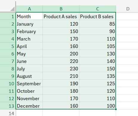
Highlight the range of cells from A1 to C13. This includes the headers (Month, Product A Sales, Product B Sales) and all the data. Sorting your data by date before creating a scatter plot can also ensure that your data points follow a logical order, especially when dealing with time-series data.
Inserting the Scatter Plot
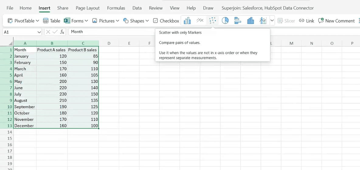
After selecting the data that you want a scatter plot of, go to the insert column and over there click on the scatter plot option.
You will notice that the scatter chart has been successfully created.
Tips for Enhancing Your Scatter Plot
Adjusting Point Style and Color
To make your scatter plot easier to read, adjust the point size, shape, and color in the Customize tab of the Chart Editor. Finding overlaps or reoccurring trends in your dataset can also be aided by highlighting duplicates before plotting.
Adding Trendlines
You can see the general direction or pattern in your data with the use of trendlines. By selecting the "Trendline" box under the "Series" section of the "Customize" menu, you can create a trendline.
Practical Example: Creating a Scatter Plot for Sales Data
Suppose you have a year's worth of monthly sales data for two items. Here's how to use a scatter plot to see this data:
Enter your information in the Product A and Product B columns.
Emphasize the range of data.
Use the procedures mentioned above to insert a scatter plot.
Add a trendline to each data and identify the axes with the product names to personalize the scatter plot.
Common Issues and How to Resolve Them
Data not displaying correctly: Ensure your data is in numerical format and there are no blank cells within the data range.
Points overlapping: Adjust the size and transparency of the points in the Customize tab to make overlapping points more distinguishable.
Conclusion
When working with data in Excel, knowing how to create a scatter plot is a highly useful tool. Thanks to the straightforward instructions, creating scatter plots in Excel is simple and may be customized to one's preferences. Scatter plots are the ideal option if you need to compare two variables, see patterns and relationships in your data, or simply wish to display your data more visually.
Say Goodbye to Tedious Data Exports! 🚀
Are you tired of the hassle of manually moving data from various tools into Excel? Superjoin has a solution for you.
Superjoin is an Excel add-in that automatically connects your favorite SaaS tools to your spreadsheets. It pulls data directly into Excel, allowing you to create reports that update themselves without any manual work on your part.
Bid farewell to tedious exports and repetitive tasks. With Superjoin, you can add one additional day to your week. Try Superjoin for free or schedule a demo.
Excel is a dependable and efficient program that lets users make a variety of charts and graphs for assessments. Scatter plots are best suited for illustrating the relationship between two sets of data. Simply said, while examining data, the ability to create a scatter plot chart is essential for researchers, students, and other professionals. A detailed method for creating scatter plots is given in this article.
Introduction to Scatter Plots
The values of two variables for a collection of data are represented graphically by a scatter plot, also known as a scattergram or scatter chart. The data is displayed as a collection of points, with the ordinate representing the value of one variable and the abscissa representing the value of the other. This makes it possible to spot patterns, correlations, and irregularities in the data, leading to a complete understanding.
Scatter plots can be extremely useful in corporate settings for connection analysis, such as comparing consumer interaction with product purchases, in addition to their application in academia and research.
For example, companies can easily import customer data from Intercom and use it to create a scatter plot against important KPIs like response times or satisfaction ratings by connecting Intercom to Excel. Teams can make better decisions about customer service or sales tactics by using this visual representation to swiftly see trends.
Step-by-Step Guide on How to Make a Scatter Plot in Excel
Input Your Data
As seen below, enter the data into an Excel sheet. The months should be listed in the first column, followed by Product A sales in the second and Product B sales in the third. You may already be aware of how effective it is to apply formulas across entire columns if you're working with big datasets.
Select Your Data
Highlight the range of cells from A1 to C13. This includes the headers (Month, Product A Sales, Product B Sales) and all the data. Sorting your data by date before creating a scatter plot can also ensure that your data points follow a logical order, especially when dealing with time-series data.
Inserting the Scatter Plot
After selecting the data that you want a scatter plot of, go to the insert column and over there click on the scatter plot option.
You will notice that the scatter chart has been successfully created.
Tips for Enhancing Your Scatter Plot
Adjusting Point Style and Color
To make your scatter plot easier to read, adjust the point size, shape, and color in the Customize tab of the Chart Editor. Finding overlaps or reoccurring trends in your dataset can also be aided by highlighting duplicates before plotting.
Adding Trendlines
You can see the general direction or pattern in your data with the use of trendlines. By selecting the "Trendline" box under the "Series" section of the "Customize" menu, you can create a trendline.
Practical Example: Creating a Scatter Plot for Sales Data
Suppose you have a year's worth of monthly sales data for two items. Here's how to use a scatter plot to see this data:
Enter your information in the Product A and Product B columns.
Emphasize the range of data.
Use the procedures mentioned above to insert a scatter plot.
Add a trendline to each data and identify the axes with the product names to personalize the scatter plot.
Common Issues and How to Resolve Them
Data not displaying correctly: Ensure your data is in numerical format and there are no blank cells within the data range.
Points overlapping: Adjust the size and transparency of the points in the Customize tab to make overlapping points more distinguishable.
Conclusion
When working with data in Excel, knowing how to create a scatter plot is a highly useful tool. Thanks to the straightforward instructions, creating scatter plots in Excel is simple and may be customized to one's preferences. Scatter plots are the ideal option if you need to compare two variables, see patterns and relationships in your data, or simply wish to display your data more visually.
Say Goodbye to Tedious Data Exports! 🚀
Are you tired of the hassle of manually moving data from various tools into Excel? Superjoin has a solution for you.
Superjoin is an Excel add-in that automatically connects your favorite SaaS tools to your spreadsheets. It pulls data directly into Excel, allowing you to create reports that update themselves without any manual work on your part.
Bid farewell to tedious exports and repetitive tasks. With Superjoin, you can add one additional day to your week. Try Superjoin for free or schedule a demo.
FAQs
How can I add labels to individual points in my scatter plot?
How can I add labels to individual points in my scatter plot?
Can I create a scatter plot with more than two data sets?
Can I create a scatter plot with more than two data sets?
How do I make a scatter plot interactive in Excel?
How do I make a scatter plot interactive in Excel?
Automatic Data Pulls
Visual Data Preview
Set Alerts
other related blogs

Try it now