Microsoft Excel Tutorial
How to Make a Pie Chart in Microsoft Excel
Learn how to make a pie chart in Microsoft Excel with this step-by-step guide. Customize your chart, troubleshoot issues, and gain insights.
Table of Contents
Pie charts are excellent visual aids for rapidly displaying the proportions in your data set. Pie charts make it simple to see how various components work together, whether you're tracking spending or managing sales numbers. We'll explore how to create a pie chart in Excel using a few different techniques in this blog post. Let's start by discussing why you might want to make one and how they can improve your ability to communicate data.
Why Pie Charts Matter?
A visual representation of a whole divided into slices that reflect percentages is provided by pie charts. They're great for making dashboards and doing fast comparisons that show how particular categories add to the total dataset. Pie charts are a popular tool for visualizing data distribution, from displaying which product sells the most to exposing where your spending goes.
So, how is one made? Let's dissect it.
Step-by-Step Guide: How to Create a Pie Chart in Microsoft Excel
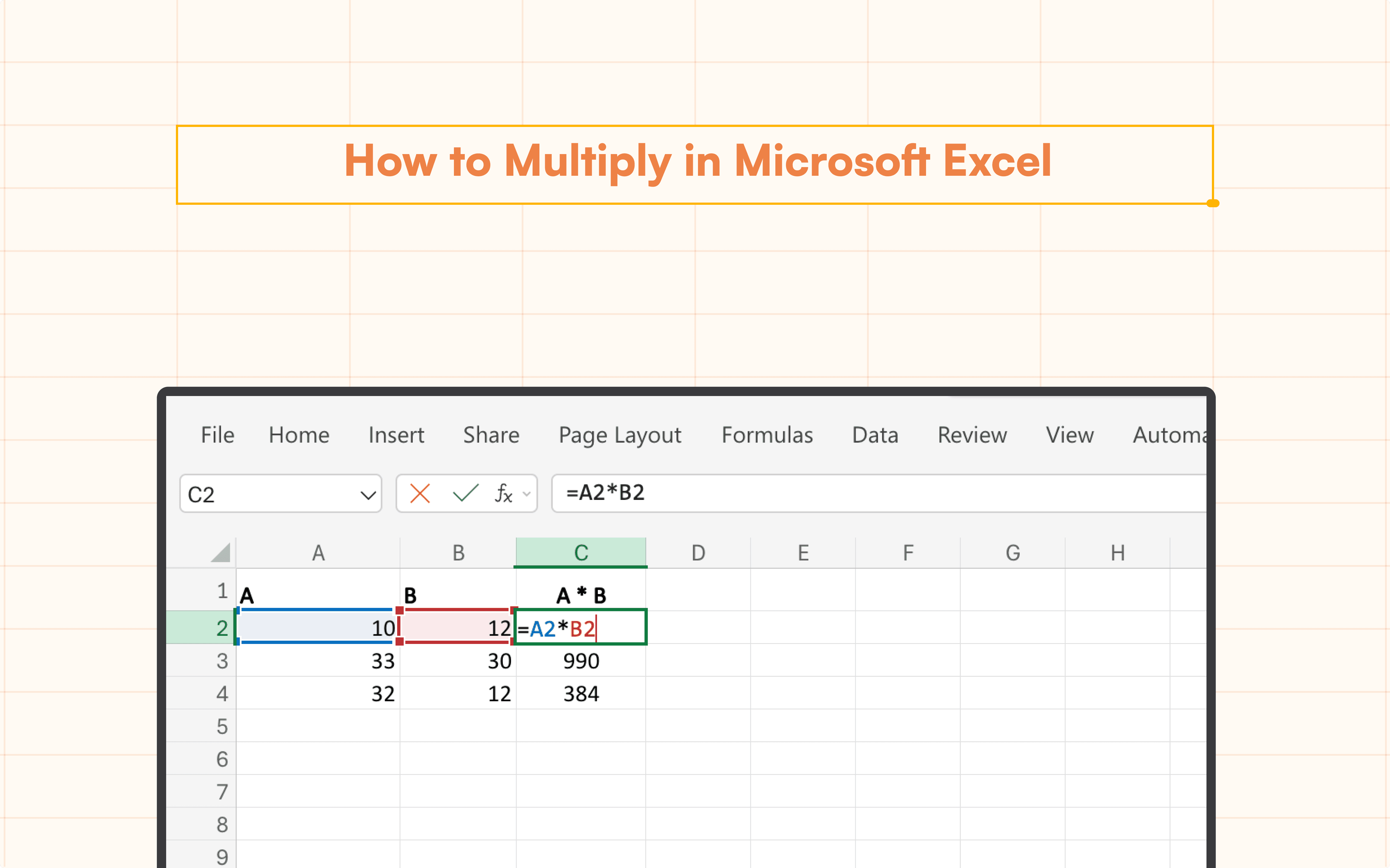
Start by Preparing Your Data
Sorting your data into two columns is the first step. List the categories such as "Department" in a single column. Enter the relevant values, such as "Total Sales," in the other.

Select Your Data
Select the entire two columns of data that include Category and Sales. Next, navigate to the Insert tab in your application.

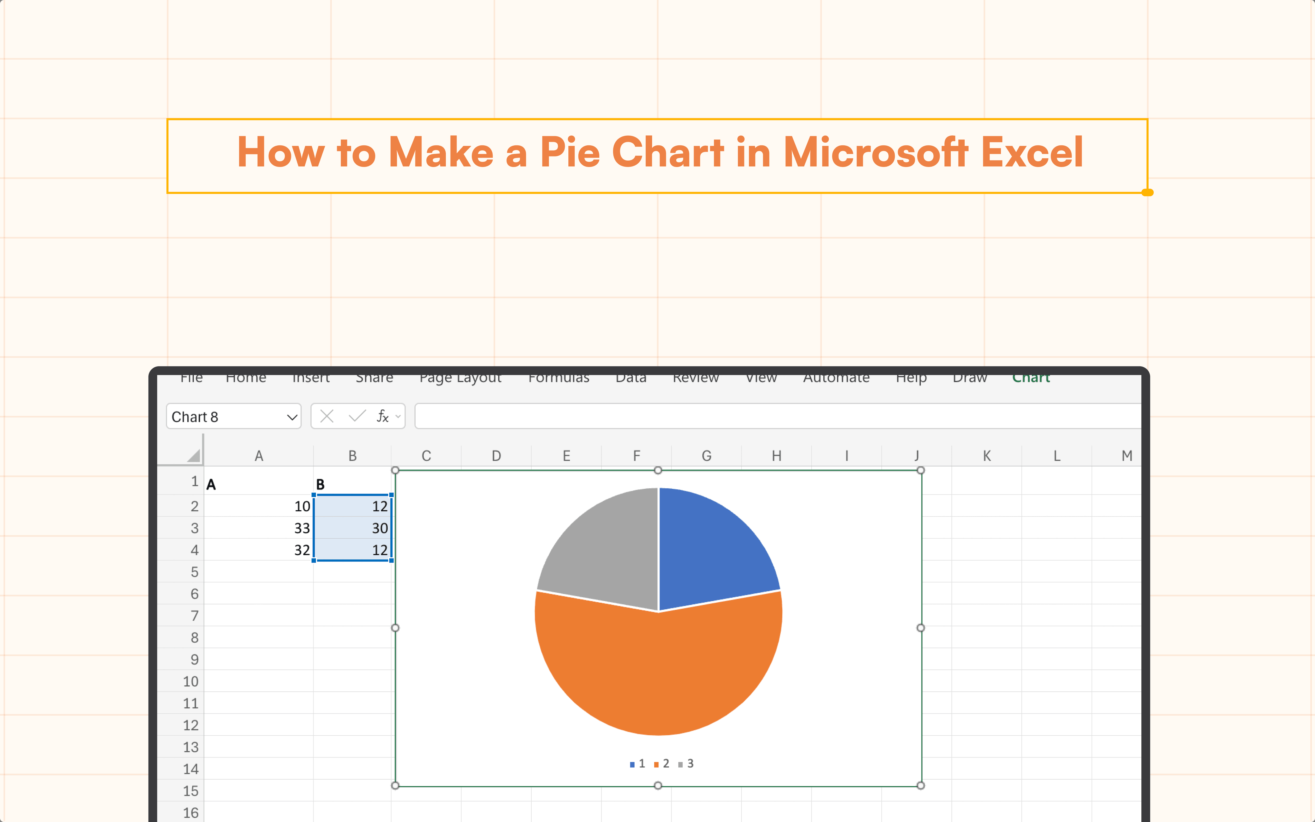
Insert your Pie Chart
Click on the Pie Chart icon to generate your chart.

You will notice that the pie chart has been applied to your data. If you click on the pie chart, you can view detailed information regarding the total number of sales per category.

Customizing Your Pie Chart
Once you understand how to make a pie chart in Excel, you may customize it to have the most impact and clarity possible. Here are some pointers:
Legend Positioning: To better suit your report or presentation, you can reposition the legend to the left, right, top, or bottom.
Slice Labels: To help viewers easily understand how much each slice represents of the total, add percentage labels to the slices.
Colors: To make it easier to distinguish the slices, use contrasting hues. Alternatively, match other marketing materials to the color scheme of your brand.
Troubleshooting Common Issues
Things can go awry even if you know how to create a pie chart in Excel. Here are a few typical problems and solutions:
1. The pie chart does not display the data: Make sure all of your information is in numerical form. Pie charts cannot be used with data values that are not numbers.
2. "Other" Category Is Displayed in Chart: When Excel automatically merges smaller categories, this occurs. Modify the Customize tab's options to display each data point separately.
Conclusion
Learning how to make a pie chart in Excel is a valuable skill, whether you're analyzing business performance or managing personal finances. With easy-to-follow steps and customizability, pie charts can provide clear insights that make your data more digestible. So go ahead, experiment with the methods we’ve discussed, and elevate your data visualization game. And remember, if creating formulas manually seems tedious, Superjoin's AI Formula Generator can help make the process faster and more efficient!
Say Goodbye to Tedious Data Exports! 🚀
Are you tired of the hassle of manually moving data from various tools into Excel? Superjoin has a solution for you.
Superjoin is a Excel add-in that automatically connects your favorite SaaS tools to your spreadsheets. It pulls data directly into Excel, allowing you to create reports that update themselves without any manual work on your part.
Bid farewell to tedious exports and repetitive tasks. With Superjoin, you can add one additional day to your week. Try Superjoin for free or schedule a demo.
Pie charts are excellent visual aids for rapidly displaying the proportions in your data set. Pie charts make it simple to see how various components work together, whether you're tracking spending or managing sales numbers. We'll explore how to create a pie chart in Excel using a few different techniques in this blog post. Let's start by discussing why you might want to make one and how they can improve your ability to communicate data.
Why Pie Charts Matter?
A visual representation of a whole divided into slices that reflect percentages is provided by pie charts. They're great for making dashboards and doing fast comparisons that show how particular categories add to the total dataset. Pie charts are a popular tool for visualizing data distribution, from displaying which product sells the most to exposing where your spending goes.
So, how is one made? Let's dissect it.
Step-by-Step Guide: How to Create a Pie Chart in Microsoft Excel
Start by Preparing Your Data
Sorting your data into two columns is the first step. List the categories such as "Department" in a single column. Enter the relevant values, such as "Total Sales," in the other.
Select Your Data
Select the entire two columns of data that include Category and Sales. Next, navigate to the Insert tab in your application.
Insert your Pie Chart
Click on the Pie Chart icon to generate your chart.
You will notice that the pie chart has been applied to your data. If you click on the pie chart, you can view detailed information regarding the total number of sales per category.
Customizing Your Pie Chart
Once you understand how to make a pie chart in Excel, you may customize it to have the most impact and clarity possible. Here are some pointers:
Legend Positioning: To better suit your report or presentation, you can reposition the legend to the left, right, top, or bottom.
Slice Labels: To help viewers easily understand how much each slice represents of the total, add percentage labels to the slices.
Colors: To make it easier to distinguish the slices, use contrasting hues. Alternatively, match other marketing materials to the color scheme of your brand.
Troubleshooting Common Issues
Things can go awry even if you know how to create a pie chart in Excel. Here are a few typical problems and solutions:
1. The pie chart does not display the data: Make sure all of your information is in numerical form. Pie charts cannot be used with data values that are not numbers.
2. "Other" Category Is Displayed in Chart: When Excel automatically merges smaller categories, this occurs. Modify the Customize tab's options to display each data point separately.
Conclusion
Learning how to make a pie chart in Excel is a valuable skill, whether you're analyzing business performance or managing personal finances. With easy-to-follow steps and customizability, pie charts can provide clear insights that make your data more digestible. So go ahead, experiment with the methods we’ve discussed, and elevate your data visualization game. And remember, if creating formulas manually seems tedious, Superjoin's AI Formula Generator can help make the process faster and more efficient!
Say Goodbye to Tedious Data Exports! 🚀
Are you tired of the hassle of manually moving data from various tools into Excel? Superjoin has a solution for you.
Superjoin is a Excel add-in that automatically connects your favorite SaaS tools to your spreadsheets. It pulls data directly into Excel, allowing you to create reports that update themselves without any manual work on your part.
Bid farewell to tedious exports and repetitive tasks. With Superjoin, you can add one additional day to your week. Try Superjoin for free or schedule a demo.
FAQs
Can I create a 3D pie chart in Excel?
Can I create a 3D pie chart in Excel?
Is there a way to split slices in pie charts?
Is there a way to split slices in pie charts?
Can I automatically generate pie charts using formulas?
Can I automatically generate pie charts using formulas?
Automatic Data Pulls
Visual Data Preview
Set Alerts
other related blogs

Try it now