Microsoft Excel Tutorial
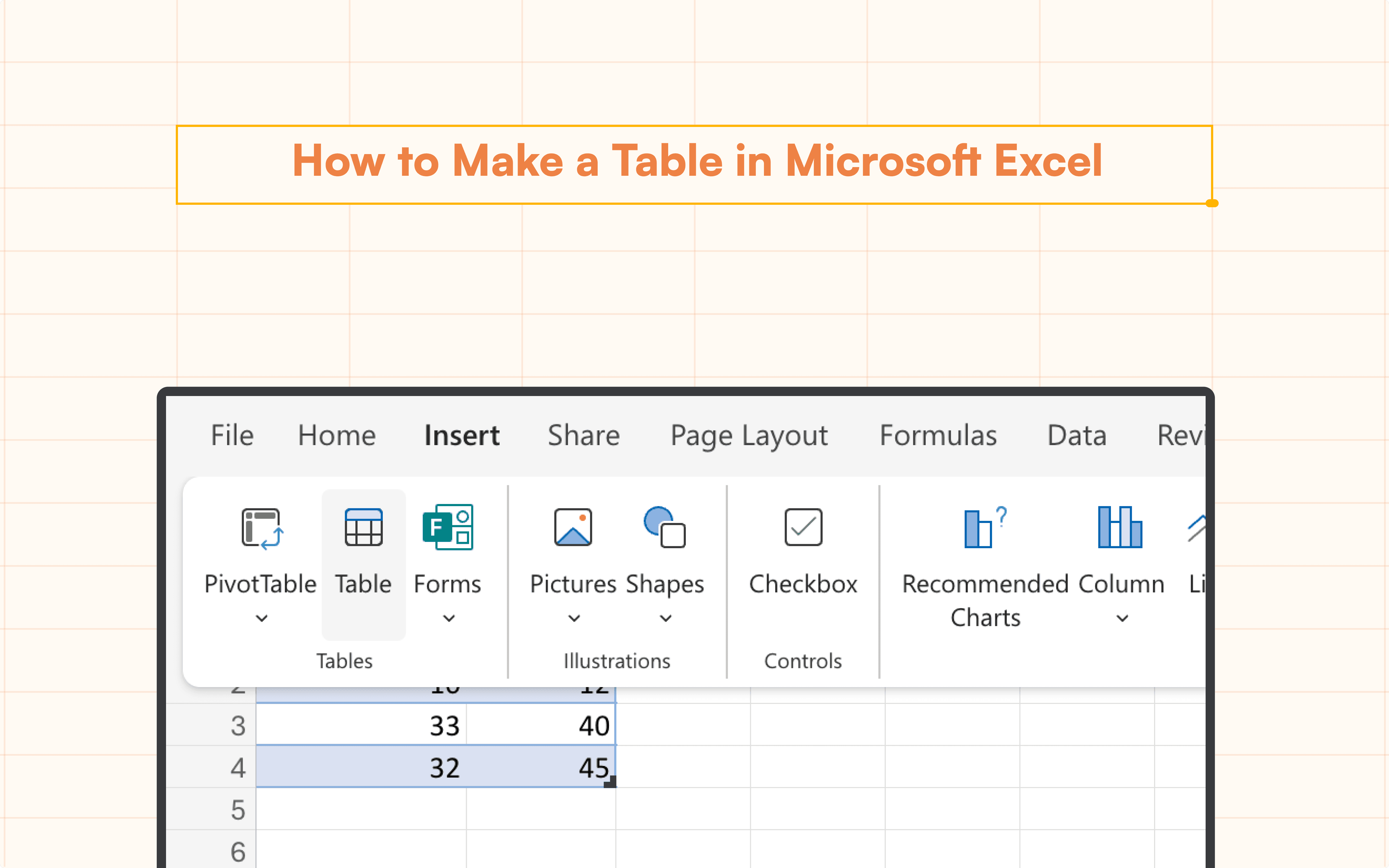
How to Make a Table in Microsoft Excel
Learn how to make a table in Microsoft Excel effortlessly. Our guide covers clear column headers, formatting tips, and troubleshooting.
Table of Contents
Tables are a great tool for organizing and analyzing data in Microsoft Excel. Gaining proficiency in Microsoft Excel table creation will greatly improve your reports. This tutorial will show you how to create a table in Microsoft Excel step-by-step and offer helpful advice on how to best organize your data.
Steps to insert a table
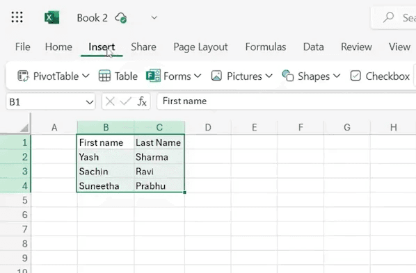
First, select the entire range of data that you want to include in your table. Next, navigate to the Insert tab in the ribbon.
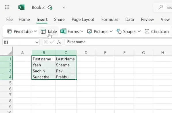
Then, click on the Table option. A dialog box will appear; here, press OK.
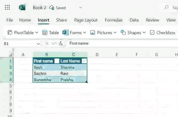
Your table is now created and will feature alternating colors for better visual appeal.
Adding Data to Your Table
It's time to add data to your table now that you know how to create one in Excel. To improve your data table, think about putting the following tactics into practice:
Column Header Clarity: Make sure that column headings are both descriptive and easy to understand so that users may quickly understand the underlying data categories.
Consistent Data Organization: Maintaining consistency in data organization is essential for smooth sorting and filtering processes. Efficiency in data processing and reporting is enhanced by a well-structured table.
Use Formulae: Make use of formulae' ability to automate computations and extract insightful information from your data. Formulas open up a world of possibilities, from simple mathematical operations to intricate statistical studies.
Put Data Validation into Practice: Use data validation guidelines to protect the integrity of your data. This reduces errors and discrepancies by guaranteeing that only pertinent and accurate data is entered into your database.
Formatting Data for Clarity and Appeal
Aesthetics play a crucial role in enhancing the appeal and readability of your data table. Consider the following formatting techniques to elevate your table to new heights:
Highlighting Important Information: To highlight important data points or headings, use formatting tools like bold or italicized text.
Diversifying Data Representation: To differentiate between different data kinds, try experimenting with font sizes, styles, and colors. Analysis and comprehension are aided by this visual distinction.
Structural Clarity: To provide visual clues for data division and organizing, use borders to separate different areas inside your table.
Conditional Formatting: Use conditional formatting to dynamically highlight cells that satisfy predetermined standards. This feature gives your data presentation more depth and interactivity.
Resolving Common Issues
Encountering hurdles during table creation is not uncommon. Here's how to troubleshoot some common issues:
Data Not Appearing: Double-check the selected data range before inserting the table to ensure all relevant data is included. Adjustments may be necessary to capture the entirety of your dataset.
Formatting Challenges: If your table appears misaligned or lacks coherence, experiment with different formatting options, such as adjusting header rows/columns or refining cell formatting.
Sorting/Filtering Difficulties: When sorting or filtering your data, verify the accuracy of your selections and ensure proper table formatting. Minor adjustments can streamline the process and enhance data clarity.
By adhering to these guidelines and troubleshooting strategies, you can craft professional-grade data tables in Excel, empowering you to efficiently organize and analyze your data.
Say Goodbye To Tedious Data Exports! 🚀
Are you tired of spending hours manually exporting CSVs from different tools and importing them into Excel?
Superjoin is a data connector for Excel that connects your favorite SaaS tools to Excel automatically. You can get data from these platforms into Excel automatically to build reports that update automatically.
Bid farewell to tedious exports and repetitive tasks. With Superjoin, you can add 1 additional day to your week. Try Superjoin for free or schedule a demo.
Tables are a great tool for organizing and analyzing data in Microsoft Excel. Gaining proficiency in Microsoft Excel table creation will greatly improve your reports. This tutorial will show you how to create a table in Microsoft Excel step-by-step and offer helpful advice on how to best organize your data.
Steps to insert a table
First, select the entire range of data that you want to include in your table. Next, navigate to the Insert tab in the ribbon.
Then, click on the Table option. A dialog box will appear; here, press OK.
Your table is now created and will feature alternating colors for better visual appeal.
Adding Data to Your Table
It's time to add data to your table now that you know how to create one in Excel. To improve your data table, think about putting the following tactics into practice:
Column Header Clarity: Make sure that column headings are both descriptive and easy to understand so that users may quickly understand the underlying data categories.
Consistent Data Organization: Maintaining consistency in data organization is essential for smooth sorting and filtering processes. Efficiency in data processing and reporting is enhanced by a well-structured table.
Use Formulae: Make use of formulae' ability to automate computations and extract insightful information from your data. Formulas open up a world of possibilities, from simple mathematical operations to intricate statistical studies.
Put Data Validation into Practice: Use data validation guidelines to protect the integrity of your data. This reduces errors and discrepancies by guaranteeing that only pertinent and accurate data is entered into your database.
Formatting Data for Clarity and Appeal
Aesthetics play a crucial role in enhancing the appeal and readability of your data table. Consider the following formatting techniques to elevate your table to new heights:
Highlighting Important Information: To highlight important data points or headings, use formatting tools like bold or italicized text.
Diversifying Data Representation: To differentiate between different data kinds, try experimenting with font sizes, styles, and colors. Analysis and comprehension are aided by this visual distinction.
Structural Clarity: To provide visual clues for data division and organizing, use borders to separate different areas inside your table.
Conditional Formatting: Use conditional formatting to dynamically highlight cells that satisfy predetermined standards. This feature gives your data presentation more depth and interactivity.
Resolving Common Issues
Encountering hurdles during table creation is not uncommon. Here's how to troubleshoot some common issues:
Data Not Appearing: Double-check the selected data range before inserting the table to ensure all relevant data is included. Adjustments may be necessary to capture the entirety of your dataset.
Formatting Challenges: If your table appears misaligned or lacks coherence, experiment with different formatting options, such as adjusting header rows/columns or refining cell formatting.
Sorting/Filtering Difficulties: When sorting or filtering your data, verify the accuracy of your selections and ensure proper table formatting. Minor adjustments can streamline the process and enhance data clarity.
By adhering to these guidelines and troubleshooting strategies, you can craft professional-grade data tables in Excel, empowering you to efficiently organize and analyze your data.
Say Goodbye To Tedious Data Exports! 🚀
Are you tired of spending hours manually exporting CSVs from different tools and importing them into Excel?
Superjoin is a data connector for Excel that connects your favorite SaaS tools to Excel automatically. You can get data from these platforms into Excel automatically to build reports that update automatically.
Bid farewell to tedious exports and repetitive tasks. With Superjoin, you can add 1 additional day to your week. Try Superjoin for free or schedule a demo.
FAQs
Can I add images or charts to my data table in Excel?
Can I add images or charts to my data table in Excel?
What if my data table contains more information than can fit on a single screen?
What if my data table contains more information than can fit on a single screen?
Are there ways to visualize data within the table itself?
Are there ways to visualize data within the table itself?
Automatic Data Pulls
Visual Data Preview
Set Alerts
other related blogs
Try it now